Copyright © 2025 Motivate Media Group. All rights reserved.
Aldo Parisotto’s minimalist dream
The founder of Parisotto+Formenton designs a thoughtful Milan penthouse.
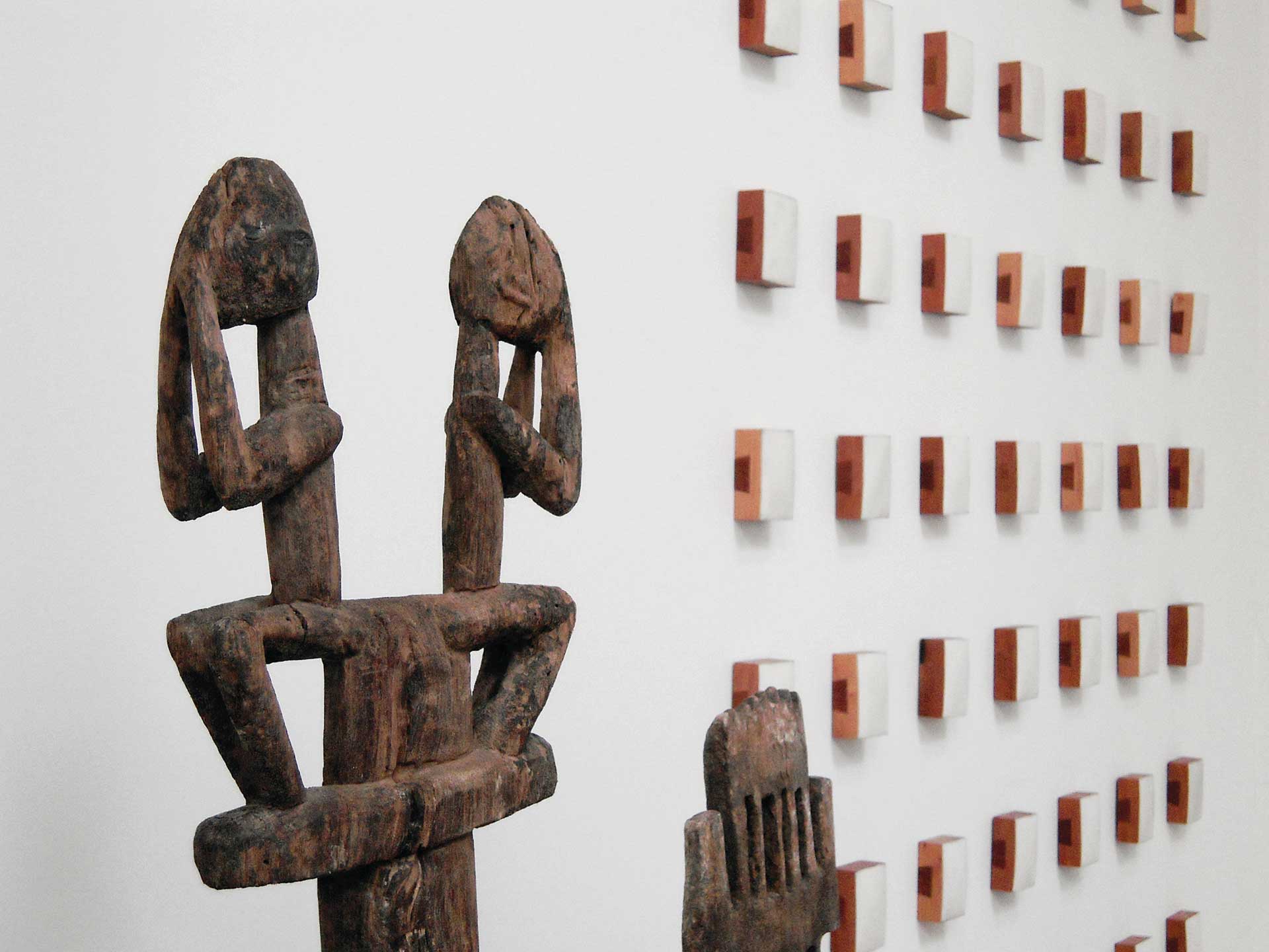
Intimidating, yet decidedly sublime, the power of the white canvas is not to be considered lightly. And, as Aldo Parisotto asserts with his Japanese-influenced design philosophy, exemplified in his captivating contemporary home in Milan, white should never be confused with blank.
“More than minimalistic, the style is quite essential. This means we create by removing rather than by adding, so that the unnecessary is left behind. The house was left simple; a white canvas. Natural skylight and contemporary art pieces are the main characters on stage,” says Parisotto, who is both architect and art collector.
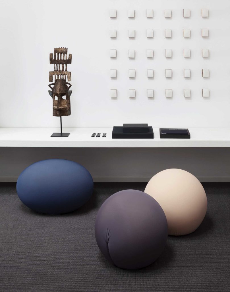
The 280-square metre renovated one-floor loft, situated inside a historic building, speaks directly to his design philosophy, which is influenced by such thoughtful tomes as The Book of Tea by Okakura Kakuzō.
He quotes from the tome and unravels the thought: “The simplicity of the tea-room and its freedom from vulgarity make it a true sanctuary from the vexations of the outer world. There and there alone one can consecrate himself to undisturbed adoration of the beautiful. This very clearly explains our approach to design: simple, essential, [with] clear space, no over-decoration, and the use of only a few materials so they can express their tactile connotations.”
Parisotto’s enviable oeuvre speaks to this philosophy as well: “One of the very first [important projects] was a museum we designed in my hometown, Monselice, [which is] close to Padua. Inside a former market, a museum of power engines creates a dialogue between industrial and minimalistic languages. In retail design (our core business), our long collaboration with Nespresso that started almost 10 years ago was crucial. As for residential design, I am especially connected to a house we did on the Sardinian coast, which was designed to connect the architecture to its natural environment.”
In the penthouse, light is a crucial component. “Let me quote a Japanese master again,” he says. “Jun’ichirō Tanizaki said in In Praise of Shadows: ‘We delight in the mere sight of the delicate glow of fading rays clinging to the surface of a dusty wall, there to live out what little remains to them. We never tire of the sight, for to us this pale glow and these dim shadows far surpass any ornament.’”
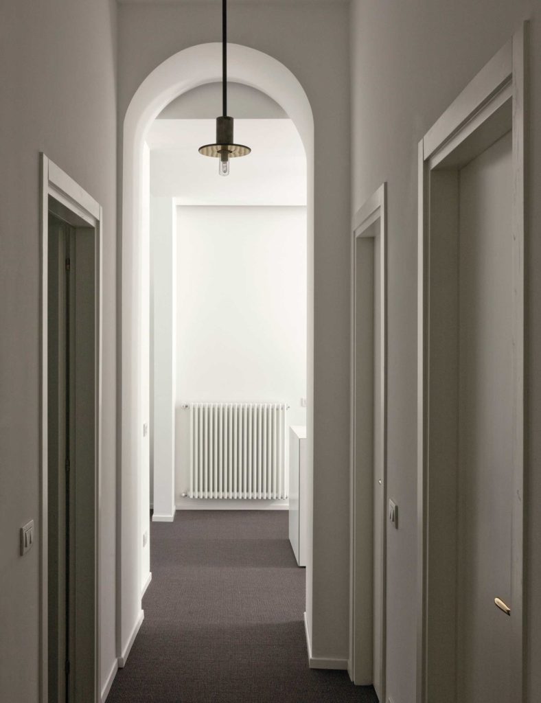
Parisotto continues: “Light is a construction material and a decoration at the same time. I like natural light to enter in the rooms and play with the surfaces of different materials. In this house, a big skylight brings sunlight directly into the living and dining room, and creates different atmospheres depending on time, season and weather.”
Yet the main architectural feature is the fluidity of the space. “What truly reflects my design approach is the fluid connection of rooms. The dining, living and kitchen areas are linked together along one axis through a gallery. This works as a pivot, as the private areas (two bedrooms, studio and bathrooms) are located along a perpendicular axis,” he explains.
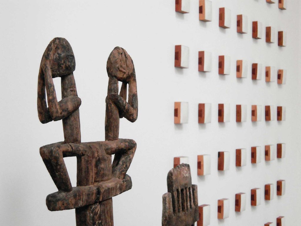
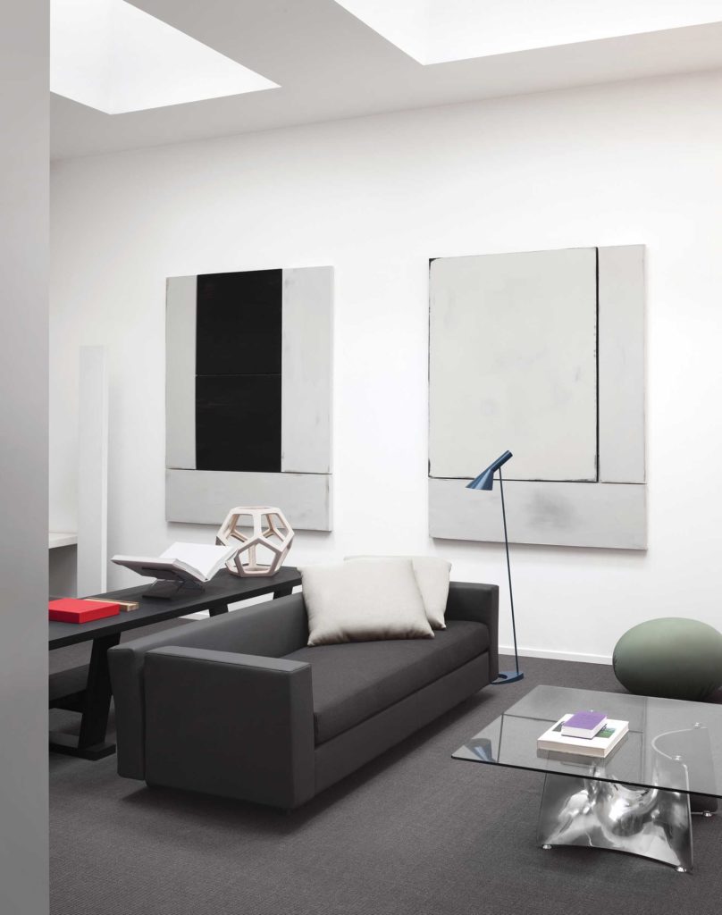
His design intelligence can also be seen in the penthouse’s surprising elements. “[It] has skylights and windows on two different sides. This means it is bright all day long, but the light is never excessive. It’s perfect for displaying contemporary art and photography (such as Mats Bergquist, David Simpson, Elisabetta Vignato and Paolo Cotani) and African art. I also love to use a mix of design pieces by great masters, such as Le Corbusier or [Gerrit] Rietveld, together with new icons edited by Baleri Italia that, although dated to the 1980s or ‘90s, are already design ‘musts.’ I usually mix contemporary design and vintage furniture to create signature atmospheres, according to the different personalities of my clients,” he says.
Other top furnishings include pieces by B&B Italia, Baleri Italia, E15, Flos, Louis Poulsen, Luceplan, Maxalto, Twentyfour 7 and Viabizzuno.
Baleri Italia’s designs were especially important for the penthouse. “The company was founded and had its golden era in the 1980s and ‘90s. Global aesthetics and economics have changed a lot since then. Despite this, most of the main values of the brand remain valid, and some of the products that the brand edited, those that could survive the decades, are already contemporary icons,” says Parisotto.
“My approach to the art direction of this company is based on the need to make the most important pieces look more contemporary, and create a dialogue with the current taste to put the brand back on the main stage.”
Living above his studio allows Parisotto’s life to be as seamless as his design. “We originally opened our studio in Padua, our hometown, in 1990. In 2004, we opened a second office in Milan. The building is full of personality, with its post-industrial spaces. As soon as an apartment was free above the studio I did not think twice,” he says.
His favourite space is the big living/dining room. “I can spend time with friends. Italians love convivial spaces to eat, drink good wine and talk in,” he says.
The Latest
How Eywa’s design execution is both challenging and exceptional
Mihir Sanganee, Chief Strategy Officer and Co-Founder at Designsmith shares the journey behind shaping the interior fitout of this regenerative design project
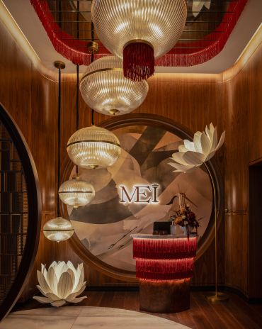
Design Take: MEI by 4SPACE
Where heritage meets modern design.
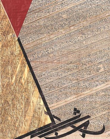
The Choreographer of Letters
Taking place at the Bassam Freiha Art Foundation until 25 January 2026, this landmark exhibition features Nja Mahdaoui, one of the most influential figures in Arab modern art
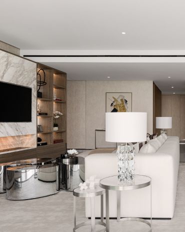
A Home Away from Home
This home, designed by Blush International at the Atlantis The Royal Residences, perfectly balances practicality and beauty
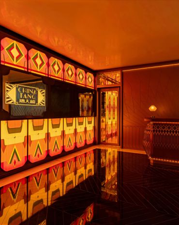
Design Take: China Tang Dubai
Heritage aesthetics redefined through scale, texture, and vision.
Dubai Design Week: A Retrospective
The identity team were actively involved in Dubai Design Week and Downtown Design, capturing collaborations and taking part in key dialogues with the industry. Here’s an overview.
Highlights of Cairo Design Week 2025
Art, architecture, and culture shaped up this year's Cairo Design Week.
A Modern Haven
Sophie Paterson Interiors brings a refined, contemporary sensibility to a family home in Oman, blending soft luxury with subtle nods to local heritage
Past Reveals Future
Maison&Objet Paris returns from 15 to 19 January 2026 under the banner of excellence and savoir-faire
Sensory Design
Designed by Wangan Studio, this avant-garde space, dedicated to care, feels like a contemporary art gallery
Winner’s Panel with IF Hub
identity gathered for a conversation on 'The Art of Design - Curation and Storytelling'.
Building Spaces That Endure
identity hosted a panel in collaboration with GROHE.

