Copyright © 2025 Motivate Media Group. All rights reserved.
Orijins cafe by VSHD is a surrealist take on a traditional coffee shop
The interior architecture studio was inspired by the imperfections of nature for its design
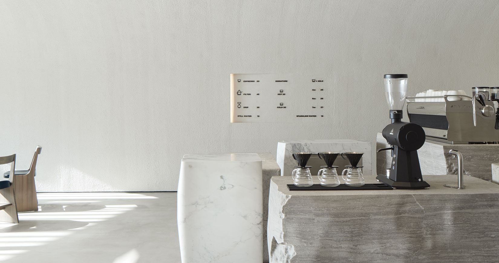
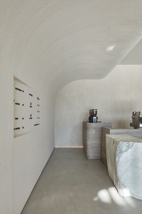
How does one reinvent the design language of a coffee shop? With VSHD Design’s Orijins café in Dubai, Rania M Hamed has done just that. Set inside a sparsely decorated space of muted plaster and cement, the design doesn’t shy away from negative space – which almost becomes as decorative as the defining design elements that dot the café itself. The envelope features curved volumes in the ceiling that ground the space, establishing a sense of natural order where organic shapes take precedence and the relationships between objects become similar to those found in nature.
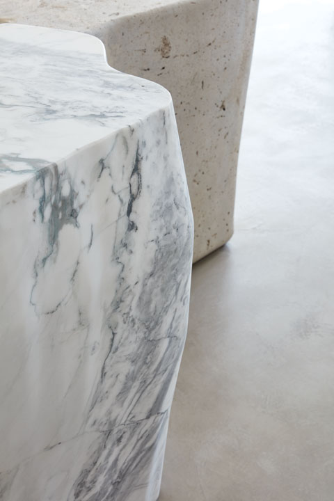
In fact, nature is the main inspiration behind Orijins, which takes cues from a collection of stones picked up from the shores of the Red Sea, often beautiful in their imperfection and contradicting forms.
“In nature, everything is imperfect, which is what makes it beautiful,” says Rania M Hamed, founder and principal at VSHD Design. “We wanted to reflect this in all the design elements used in the space.”
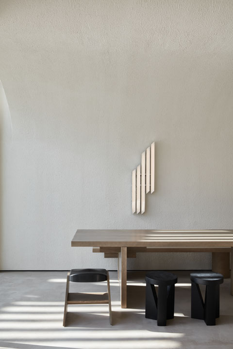
She went about this by creating a space with a rich amalgamation of contradictions: massive blocks of stone, slender lightweight metal furnishings, curvaceous elements – all set against a textured and muted backdrop. By combining a mismatched design vocabulary of sculptural, minimal, monolithic and delicate gestures, Hamed aimed to create a novel F&B experience.
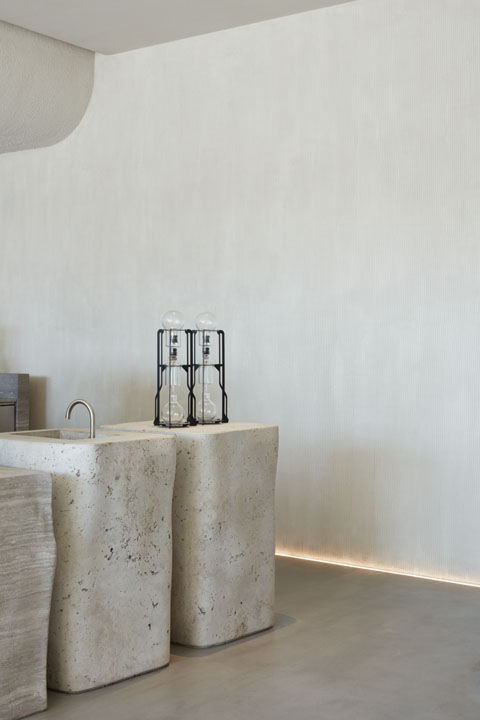
“The design of Orijins embodies our deep belief that there is so much beauty in imperfection, humility and living in tune with nature. It is a philosophy that creates designs with a timeless appeal. Orijins is our interpretation of the beauty, calm, purity and simplicity we see in nature,” she explains.
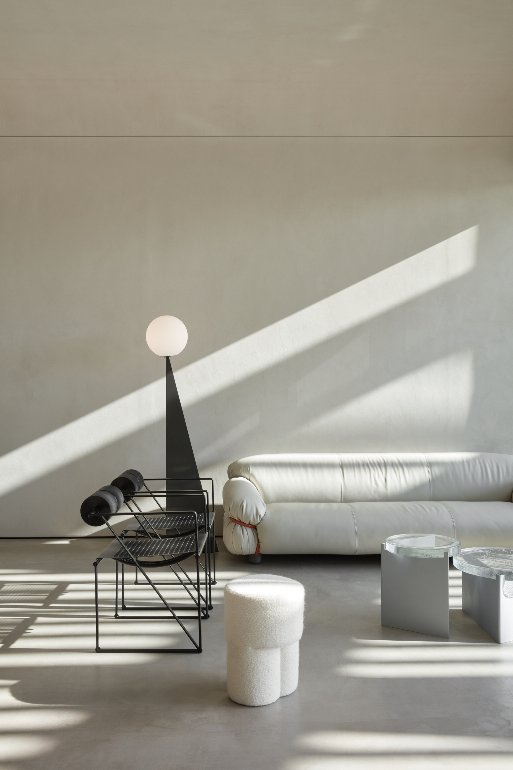
Orijins is an experiment in mass, form and texture – which can be observed from the hand-sketched blocks that eventually resulted in the counters, giving them their irregular organic effect, creating a somewhat surreal environment yet one that is both calming and inviting.
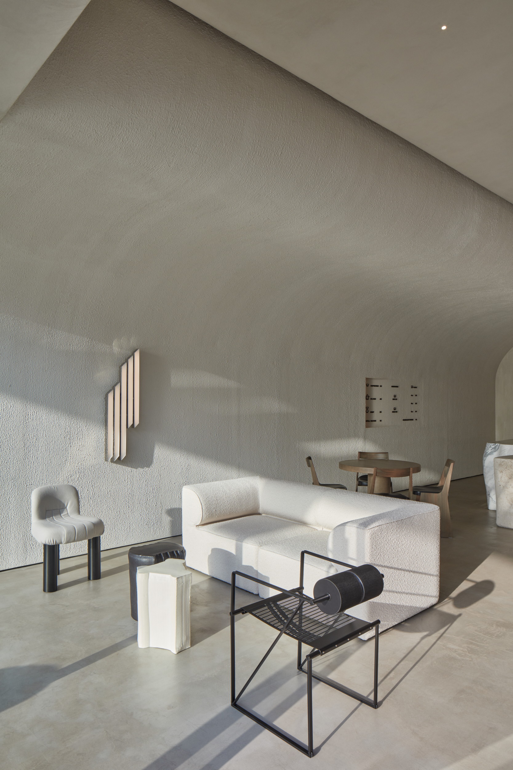
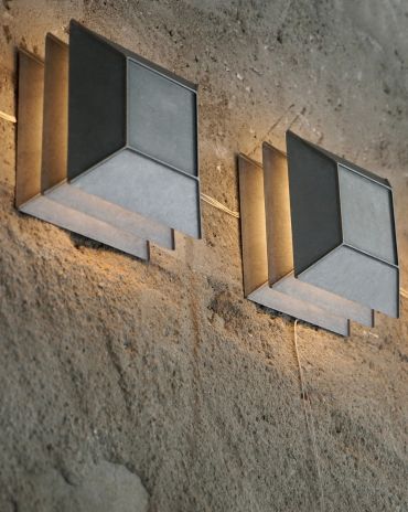
The minimalist sophistication of the design required a restricted colour palette, which borrows its subdued tones from natural elements like stones, sand and shells. There is minimal contrast and definition between the tonality of colour used across the space, which creates a rigorous but also natural union of all its elements. This pared-back approach is complemented by a mixture of textures and materials that includes textiles of fur, boucle and heavy waves that balance the rawness of the overall design. Natural light delicately enters the space, creating shadows against the plastered walls. The rest of the lighting concept has been kept as minimal and concealed as possible. A very slim LED strip sits along the length of the space to highlight the arch in the ceiling, while a tiny seamless spotlight brightens the bar area. A bespoke wall light in brushed aluminium designed by VSHD decorates the space, along with floor lamps by Areti.
Read more: VSHD Design’s interiors for Marquise Square tower offers common areas that mimic home spaces
The Latest
Winner’s Panel with IF Hub
identity gathered for a conversation on 'The Art of Design - Curation and Storytelling'.
Building Spaces That Endure
identity hosted a panel in collaboration with GROHE.
Asterite by Roula Salamoun
Capturing a moment of natural order, Asterite gathers elemental fragments into a grounded formation.
Maison Aimée Opens Its New Flagship Showroom
The Dubai-based design house opens its new showroom at the Kia building in Al Quoz.
Crafting Heritage: David and Nicolas on Abu Dhabi’s Equestrian Spaces
Inside the philosophy, collaboration, and vision behind the Equestrian Library and Saddle Workshop.
Contemporary Sensibilities, Historical Context
Mario Tsai takes us behind the making of his iconic piece – the Pagoda
Nebras Aljoaib Unveils a Passage Between Light and Stone
Between raw stone and responsive light, Riyadh steps into a space shaped by memory and momentum.
Reviving Heritage
Qasr Bin Kadsa in Baljurashi, Al-Baha, Saudi Arabia will be restored and reimagined as a boutique heritage hotel
Alserkal x Design Miami: A Cultural Bridge for Collectible Design
Alserkal and Design Miami announce one of a kind collaboration.
Minotticucine Opens its First Luxury Kitchen Showroom in Dubai
The brand will showcase its novelties at the Purity showroom in Dubai
Where Design Meets Experience
Fady Friberg has created a space that unites more than 70 brands under one roof, fostering community connection while delivering an experience unlike any other
Read ‘The Winner’s Issue’ – Note from the editor
Read the December issue now.

