Copyright © 2025 Motivate Media Group. All rights reserved.
The elegance of emptiness
Luke Hayward’s Terrace House in Kyoto, Japan is a meditation on design.
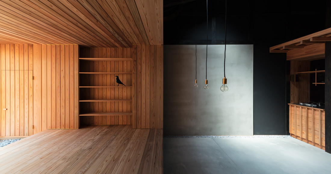
As a brilliantly choreographed staging of shadow and light, Terrace House is an exercise in both extreme restraint and excess. A clear nod to a notion of abundance linked to materiality, its textures and surfaces create a frame in which its owners can experience space in all of its complexity.
[row][column width=”50%”]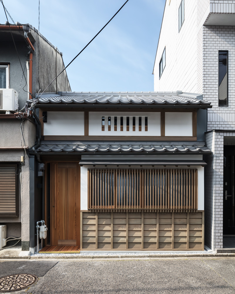 [/column][column width=”50%”]
 [/column][/row]
Located near Demachiyanagi – a typical post-war Japanese row house nestled in the quiet northern suburbs of Kyoto City – Terrace House needed an extensive renovation and extension. Originally constructed in the 1950s as part of a block of similar small houses (the floor area is only 40 m2), it served as home to a single family until it was eventually vacated and left to dilapidate for over a decade.
When Luke Hayward, principal of architecture and design studio atelier Luke, accepted the project he did so because it spoke to him in a very particular kind of way.
“The home represents an effort to refine and elaborate on the approach developed with our past work in Japan. I’ve become very interested in creating places with a strong spatial experience; there is a unique feeling of being in the spaces of this home, which is more powerful than simply creating image or composition. The sequencing of spaces and the experience of moving through them is also essential,” explains Hayward.
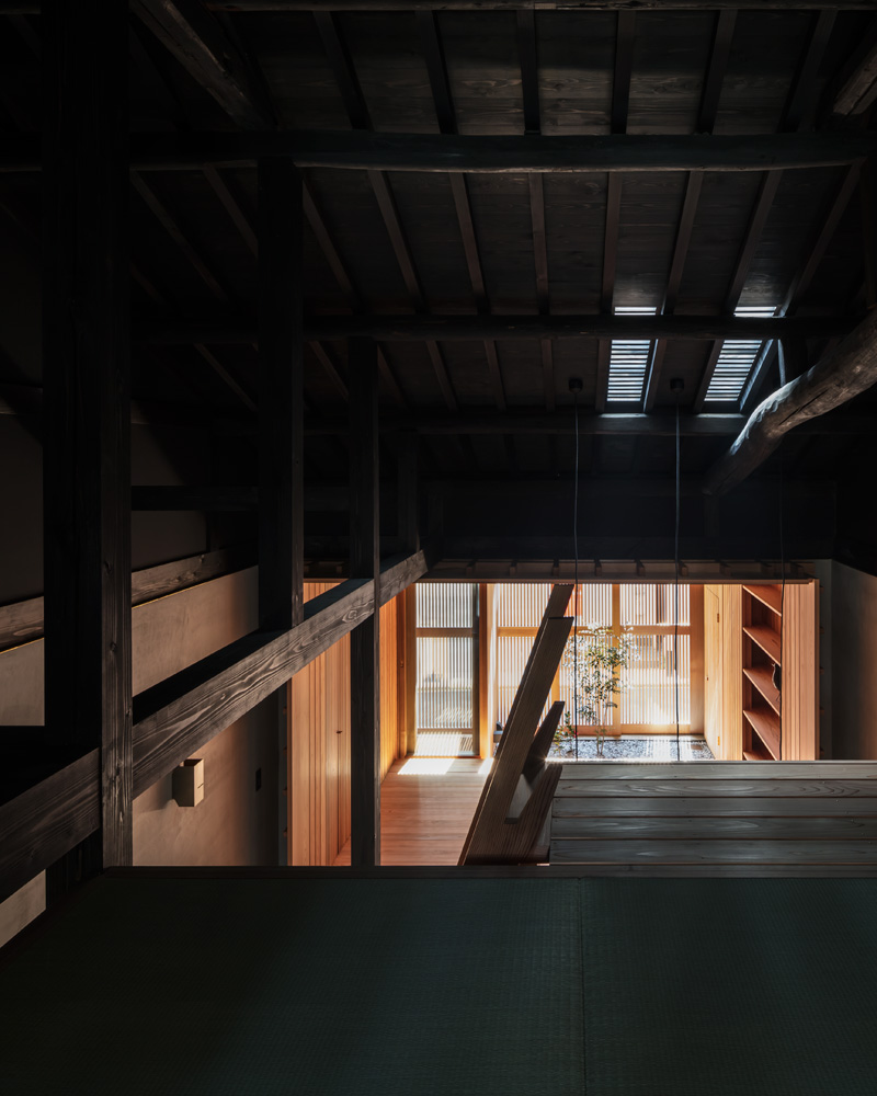
The renovation meant that Hayward removed everything – leaving what was essentially a timber interior with a dark black stain. Internally, all linings were removed, laying bare the skeletal timber structure. This process of peeling back revealed large timber roof beams that had been concealed for over half a century.
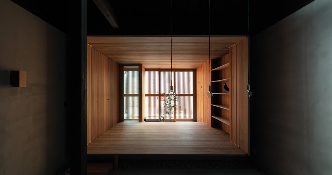
“Emptiness and void play key roles in the design. The house is very small and so it was essential that the design emphasise spaciousness where possible. Rather than simply adding space through high ceilings, we desired to create an emptiness above the living spaces. An almost depthless black void,” Hayward reveals.
Having completed many projects in Japan, Hayward used his extensive knowledge of its cultures, traditions and architectural models.
“This approach was heavily influenced by our experience of traditional Japanese residences and farm houses, which often feature a hearth below tall blackened interiors. When so much contemporary design seeks to reveal everything in perfect white light, it’s tempting to retreat into shadows and leave some things unseen,” he says.
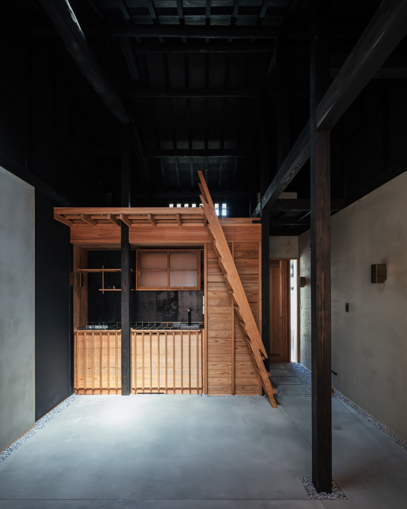
Stained entirely in black, the building’s clarified interior space serves as a void within which the new home is formed. Deep areas of shadow bring an enhanced spaciousness to this otherwise small structure.
[row][column width=”50%”]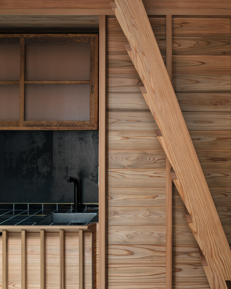 [/column][column width=”50%”]
 [/column][/row]
“Paired with this approach to space is an exploration of materials and craft, which brings a different scale to the experience. Little things, like revealing small sections of end grain in the design of the timber ladder, are all done deliberately to create pleasure in the discovery of how things are made and to reveal the different textures and qualities of the materials,” he continues.
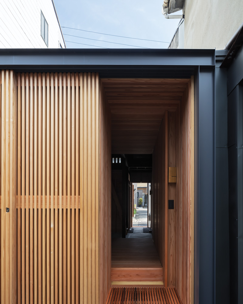
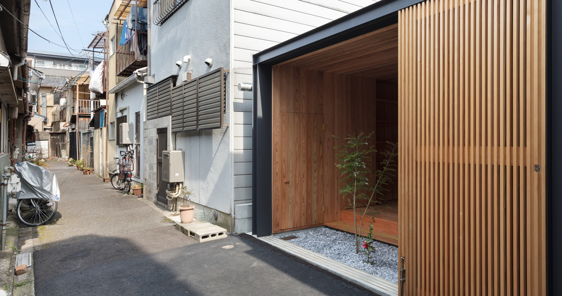
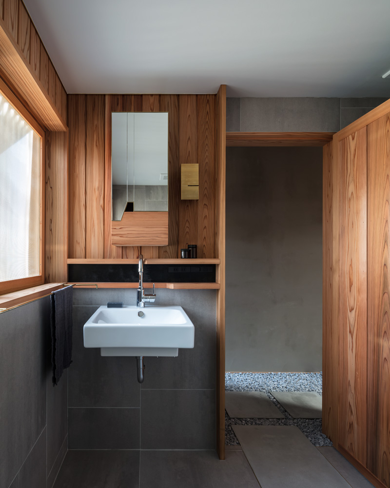
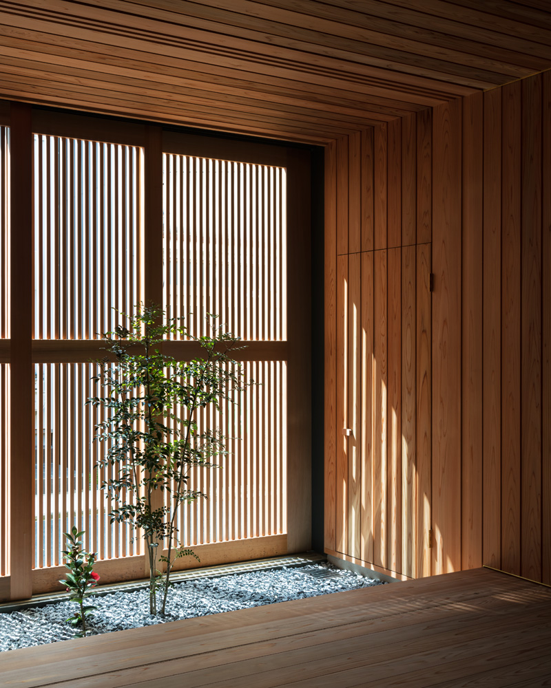
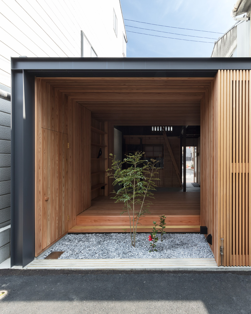
In addition, Hayward’s love of wood is evident in his commitment to preserving and highlighting its beauty – even in the darkness. At the rear, a new timber box has been inserted into this space, bringing lightness and warmth. Sliding timber doors and screens allow something rarely seen in a suburban Japanese context: an unabashed connection to the outdoors and street, via a tiny private garden. Opposite, a second timber box provides containment for the home’s amenities: a new bathroom, kitchen and laundry.
[row][column width=”50%”]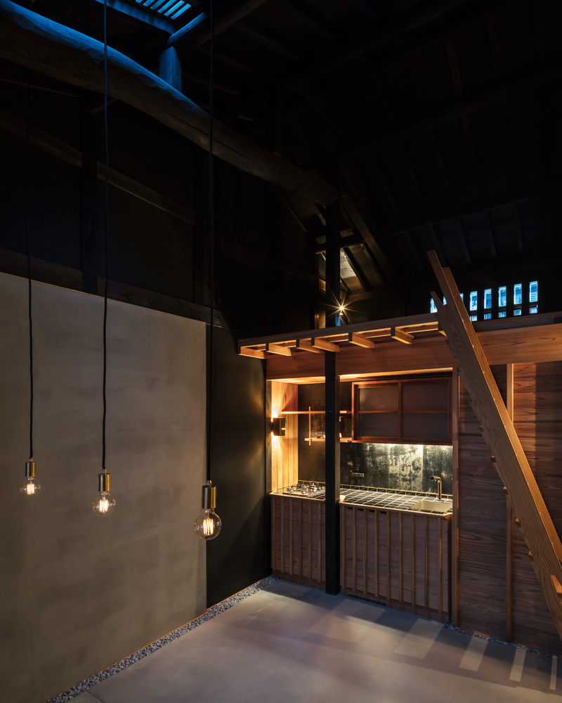 [/column][column width=”50%”]
 [/column][/row][row][column width=”50%”]
 [/column][column width=”50%”]
 [/column][/row]
This dedication to form and a complete saturation of colour meant that Hayward needed to find a way to maintain the sense of volume in this small, but impactful home.
“Working with black presents challenges. Light is needed to fill the void and to recede into shadows. But too much light and the illusion falls apart, with what should be a deep rich void becoming a dull and drab space. Plus, black is not always black, especially when trying to match black timber against black cement. Too black and the natural textures of the materials are lost; not black enough and things look unfinished,” he says.
To achieve his goal, Hayward worked closely with the local plasterer and the painters, making lots of samples and watching closely as the space came together so that adjustments could be made as needed. In addition, the front façade of the home features a mushikomado, a type of window used to ventilate the roof space in some traditional homes. This was a striking element of the pre-renovated house and the team knew it should be retained.
[row][column width=”50%”]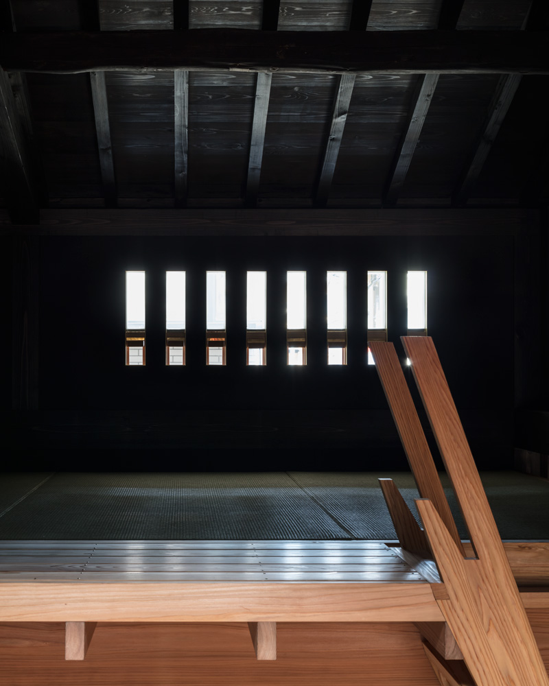 [/column][column width=”50%”]
 [/column][/row]
Hayward’s favourite space is the loft. “There’s something comforting about sitting on the tatami mats up in the darkness, looking down on the spaces below. It’s a cave-like space, contained at the rear and with the ceiling raking down tightly overhead, so you instinctively feel nestled and protected. It’s a great space for an afternoon nap,” he muses. We know we’d feel right at home in his modern masterpiece. – Joanne Molina
The Latest
A Striking Entrance
The Oikos Synua door with its backlit onyx finish makes a great impression at this home in Kuwait.
Marvel T – The latest launch by Atlas Concorde
Atlas Concorde launches Marvel T, a new interpretation of travertine in collaboration with HBA.
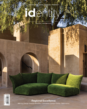
Read ‘Regional Excellence’ – Note from the editor
Read the magazine on issuu or grab it off newsstands now.
Chatai: Where Tradition Meets Contemporary Calm
Inspired by Japanese tea rooms and street stalls, the space invites pause, dialogue, and cultural reflection in the heart of Dubai Design District
A Floating Vision: Dubai Museum of Art Rises from the Creek
Inspired by the sea and pearls, the Dubai Museum of Art becomes a floating ode to the city’s heritage and its boundless artistic ambition.
Heritage Reimagined
Designlab Experience turns iconic spaces into living narratives of Emirati culture, luxury, and craftsmanship.
Nakhla by Nada Debs
Nakhla symbolises resilience, prosperity and a deep connection to the land
Wave: The New Mediterranean Haven in Dubai
IDST’s design invites exploration with a thoughtful blend of artisanal craftsmanship and contemporary style.
The Chedi Wadi Safar
Bjarke Ingels Group (BIG) and KCA International are collaborating to launch this new hotel
A New Era of Early Learning
Roar crafts the PIF Daycare Centre in Riyadh with a calming, sensory-rich environment where design, nature and childhood development come together.
When Art Meets Light
Brush and Switch by Sans Souci bend light in unexpected ways
The Importance of Community-Driven Design
We speak to Joanna Varettas, Senior Associate Designer at TGP International on the story of Seed & Bloom – a café designed to nurture connection and community engagement


