Copyright © 2025 Motivate Media Group. All rights reserved.
The shape of things: Narrow House
London-based FORMstudio has created a residence on a pencil-thin site in Covent Garden.
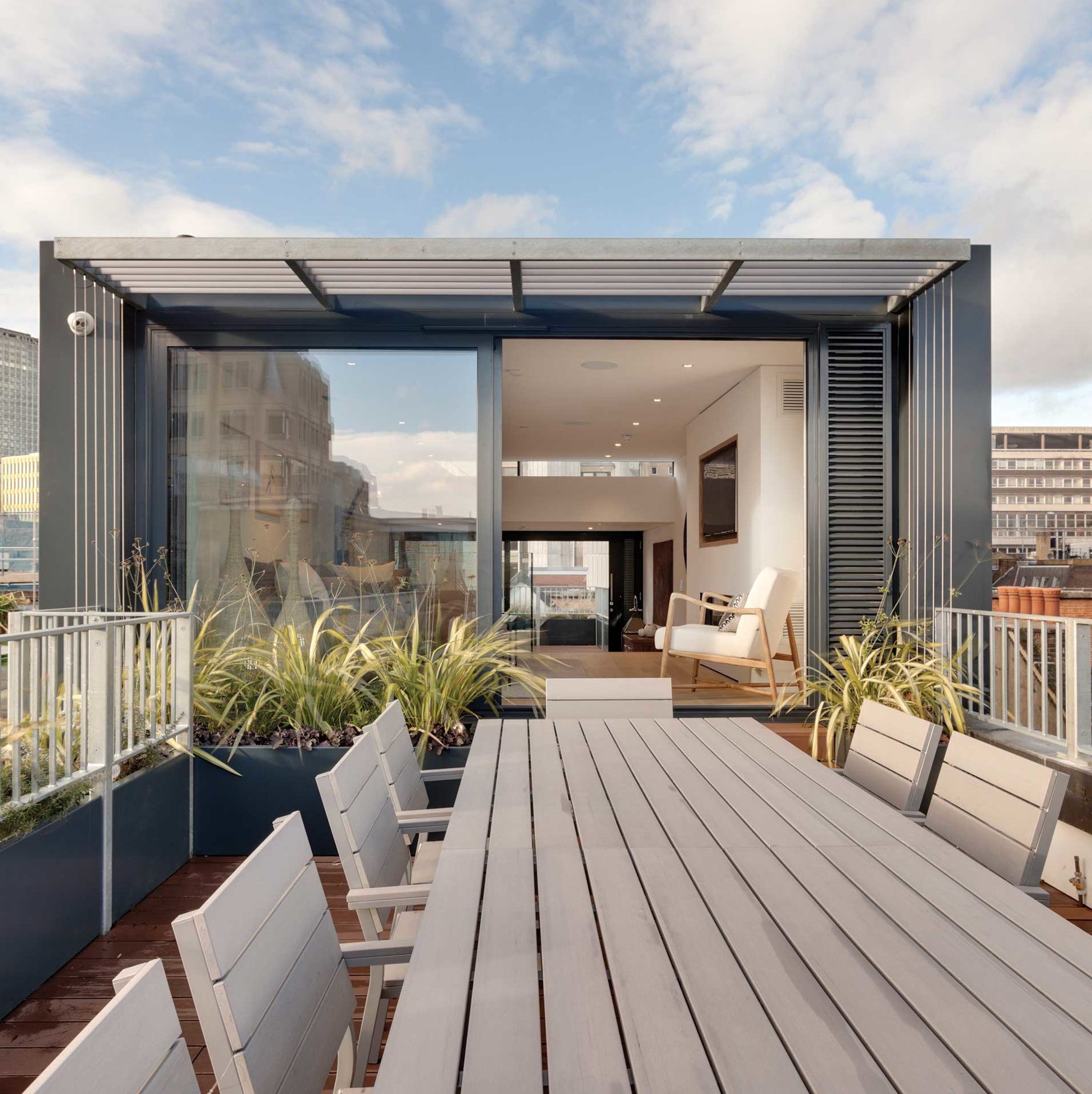
Despite the innovative vertical residential design coup, nobody can accuse FORMstudio of having its head in the clouds. With intellectual fervour and aesthetic ingenuity, the company’s nuanced spatial approach has transformed a tall, deep terraced late 19th-Century office building into a 3.5-metre-wide, six-floor home with dramatic double-height volumes.
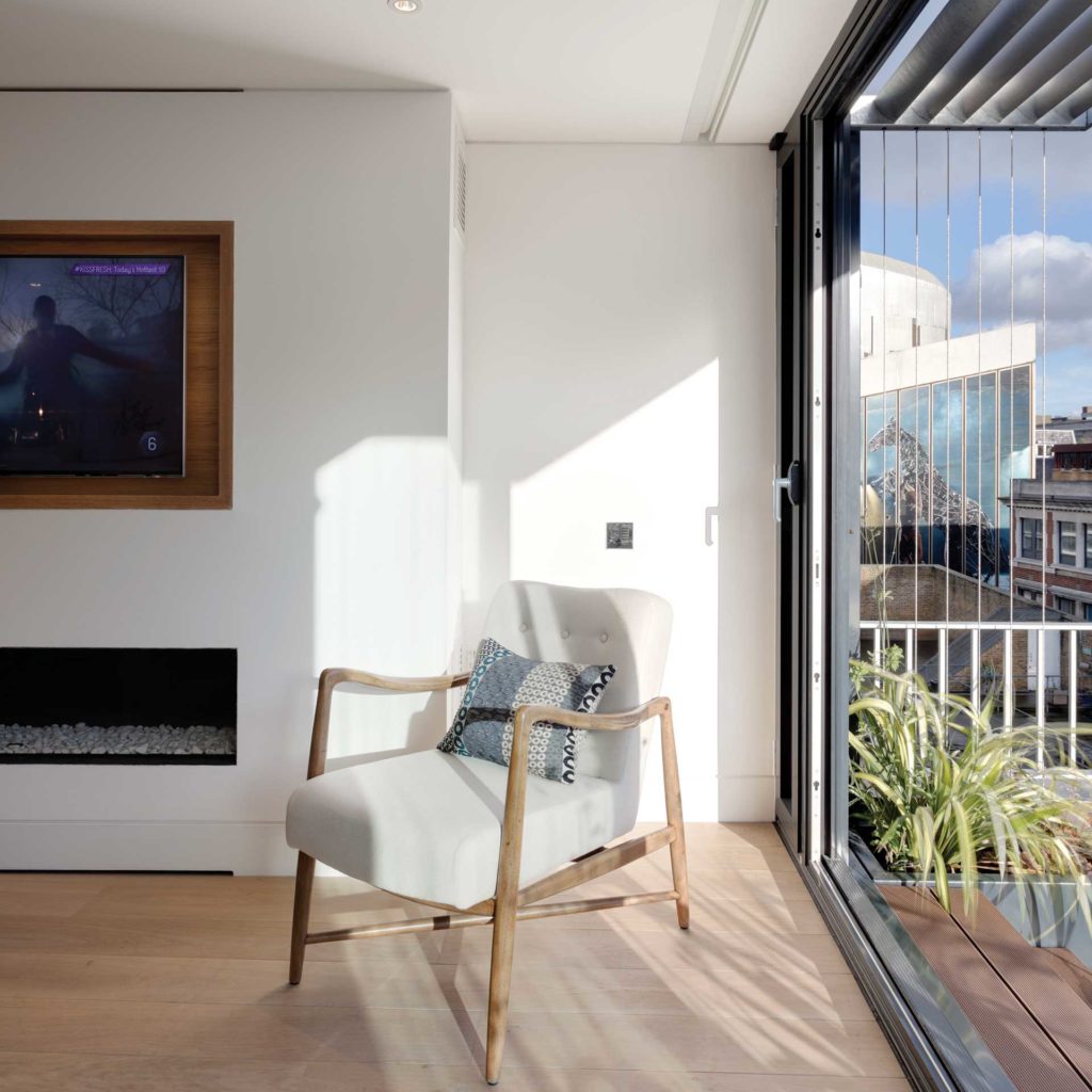
“We are modernists at heart, albeit pragmatic ones, so our starting point is invariably functionality. In this case, the intrinsic unsuitability of the building for its previous use as office space was quickly identified, along with the potential for it to be re-imagined as an exciting, light-filled and practical house,” says Malcolm Crayton, Director.
The 436 m2 four-bedroom home illustrates this commitment to listening to clients in an active way, and clarifying the significant. “Our projects are always the result of close collaboration with our clients and this was no exception, with many of the final details and design choices ensuing from round-the-table discussion,” Crayton explains.
“A good example of us ‘clarifying the significant’ in this project is our treatment of the existing lift shaft and the stair that wraps around it. All the original extraneous details such as planted skirtings, handrails, different finishes, lighting and boxed-out casings have been expunged, clarifying the clean geometry of the refinished oak-clad stair rising around a square marble-plaster finished lift-tower. Shadow gap detailing, carefully considered discreet lighting and custom-designed handrails complete the calm composition.”

And while all of FORM’s past projects have given them insight into how to keep the home as wide as possible while maintaining a visually clean aesthetic, two in this case were especially helpful, says Crayton: “Botolph Lane involved the conversion of an existing office building into 14 apartments, and the addition of two penthouse floors, a ‘shopfront’ treatment and creative use of the lower ground floor spaces; and our Lower Mall house by the River Thames, which involved the complete reconfiguration of a former vicarage and community building.”
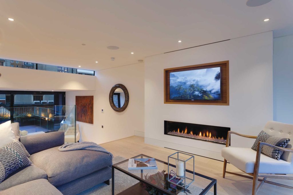
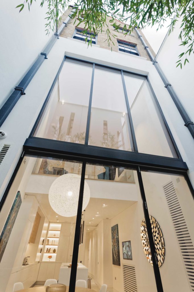
Crayton cites four definitive architectural elements and interior design details: “Firstly, a metalwork screen on the pavement line reflecting the format and scale of a shopfront allows the dramatic etched glass entrance door screen to the house to be set back from the street behind a generous covered courtyard space. Secondly, removing a section of the first floor and infilling the rear lightwell (creating a larger gym space below) allowed us to create a double-height ground floor kitchen/dining space with an open gallery study above, and a 6m-high window wall that opens onto a courtyard.” Others include the rooftop studio living space and terraces, and the state-of-the art cinema.
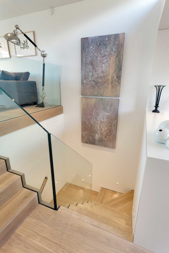
An array of finely tuned details that might escape the untrained eye create the elegant movement that defines this refined space. “To improve the spatial flow and the general sense of openness, the doors to all the reception rooms are held open on electro-magnetic holds in pocketed side enclosures, and polished stainless steel handrails streamline the narrow staircase,” says Crayton.
In addition: “The organic shape of the oak-clad cloakroom/WC pod adds interest to the entrance hall and creates increased space around the front door, and the slips of mirror on the rear wall of the ground floor courtyard behind the giant bamboos create depth and dynamic reflections of the light from the interior at night. Systems throughout control [the] lighting, AV, heating/air con and blinds via hand-held tablets.”
The elements that shape the soul of this project also resonate for Crayton because of his concerns about the field’s future. “Whilst fashion will always have an impact on design and architecture the market-driven search for stylistic novelty concerns me. Genuinely good architecture and design has a very long shelf-life and is a much better and more sustainable use of the enormous resources involved in making buildings and fitting out interiors,” he says.
“Another concern, not so easily answered, is the ever-increasing matrix of rules and regulations. Whilst the intentions of these are generally well-meaning, in practice different agendas often conflict – and much of the regulatory framework is diminishing the scope for capable architects to use their skills to develop individual, pragmatic, project-specific design solutions.”
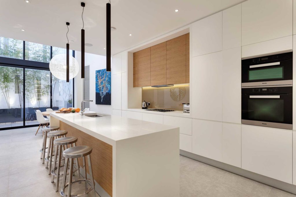
His favourite space in this home? “Probably the kitchen/dining area. Having known how dark and unappealing the original ground floor room was, the transformation to a light-filled dramatic double-height space opening onto a landscaped courtyard, and with a view to the sky, is a particular success.”
The Latest
How Eywa’s design execution is both challenging and exceptional
Mihir Sanganee, Chief Strategy Officer and Co-Founder at Designsmith shares the journey behind shaping the interior fitout of this regenerative design project
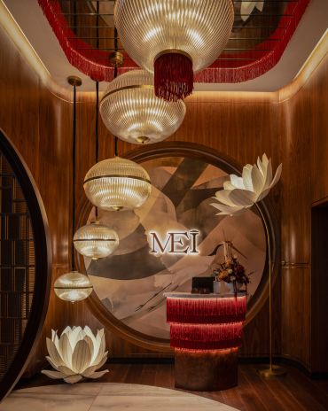
Design Take: MEI by 4SPACE
Where heritage meets modern design.
The Choreographer of Letters
Taking place at the Bassam Freiha Art Foundation until 25 January 2026, this landmark exhibition features Nja Mahdaoui, one of the most influential figures in Arab modern art
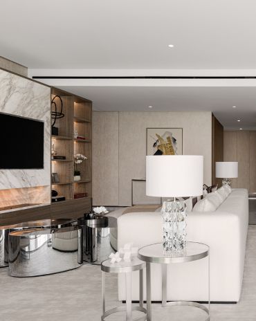
A Home Away from Home
This home, designed by Blush International at the Atlantis The Royal Residences, perfectly balances practicality and beauty
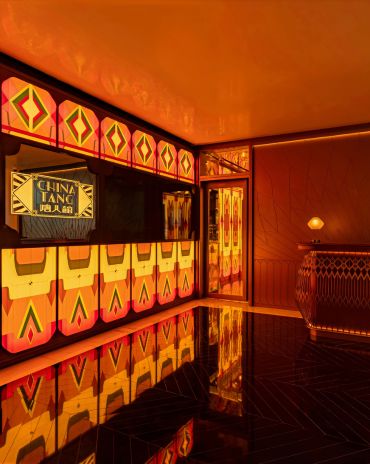
Design Take: China Tang Dubai
Heritage aesthetics redefined through scale, texture, and vision.
Dubai Design Week: A Retrospective
The identity team were actively involved in Dubai Design Week and Downtown Design, capturing collaborations and taking part in key dialogues with the industry. Here’s an overview.
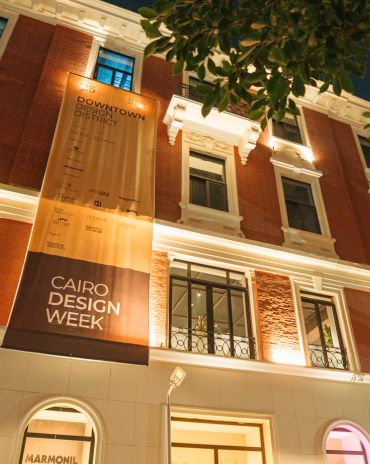
Highlights of Cairo Design Week 2025
Art, architecture, and culture shaped up this year's Cairo Design Week.
A Modern Haven
Sophie Paterson Interiors brings a refined, contemporary sensibility to a family home in Oman, blending soft luxury with subtle nods to local heritage
Past Reveals Future
Maison&Objet Paris returns from 15 to 19 January 2026 under the banner of excellence and savoir-faire
Sensory Design
Designed by Wangan Studio, this avant-garde space, dedicated to care, feels like a contemporary art gallery
Winner’s Panel with IF Hub
identity gathered for a conversation on 'The Art of Design - Curation and Storytelling'.
Building Spaces That Endure
identity hosted a panel in collaboration with GROHE.

