Copyright © 2025 Motivate Media Group. All rights reserved.
Take an exclusive look inside The Dubai Edition designed by LW Design Group
The Dubai Edition offers a serene escape in the heart of the city
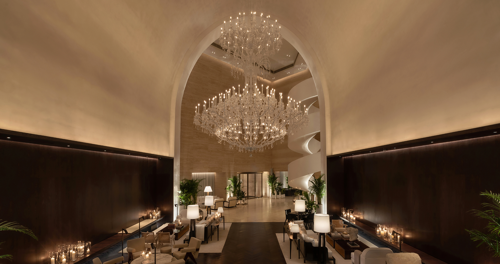
Set in the heart of Downtown Dubai is the region’s newest (and second) Edition hotel, designed by Dubai-based LW Design Group – who have gone against the grain to create an understated, minimalist property that defies the outwardly luxurious hotels the city has come to be known for. In true Edition fashion (the hotel describes itself as an ‘anti-hotel chain’), the design is perhaps not what one would expect, yet it is noteworthy for its simplicity and allows one to truly pay attention to the details that matter – such as its materiality, architectural forms and intimate ambience.
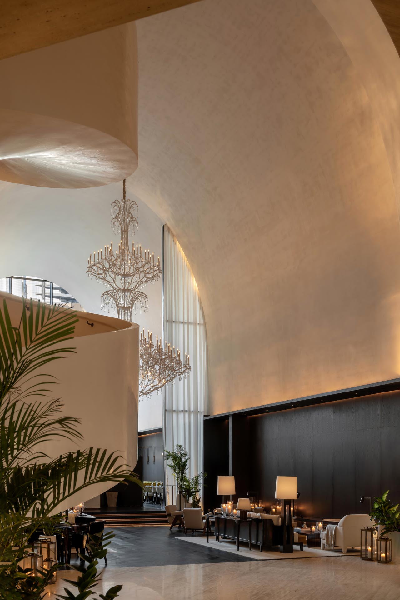
Created in collaboration with Ian Schrager Company in New York, the team at the LW Design Group was at the helm of both The Dubai Edition’s architectural design and interiors, a feat of firsts for the regional hospitality design connoisseurs. “The Dubai Edition is understated and represents exquisite luxury, attention to detail and [boldness],” says Jesper Godsk, founder and CEO of LW Design Group. He adds that today, the sophisticated traveller is the norm and not the exception – and with that comes a rewriting of what luxury and sophistication mean in a hospitality space.
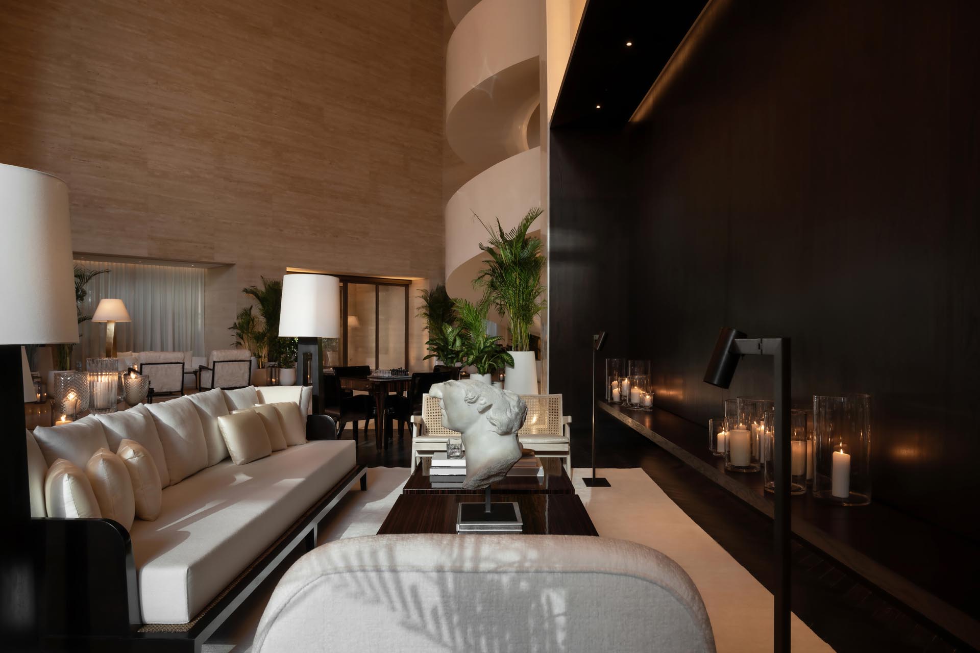
“It was more complicated than we thought to create something effortless while still creating something that would have the biggest impact in the market by being completely different,” says Pooja Shah-Mulani, design director at LW Design Group.
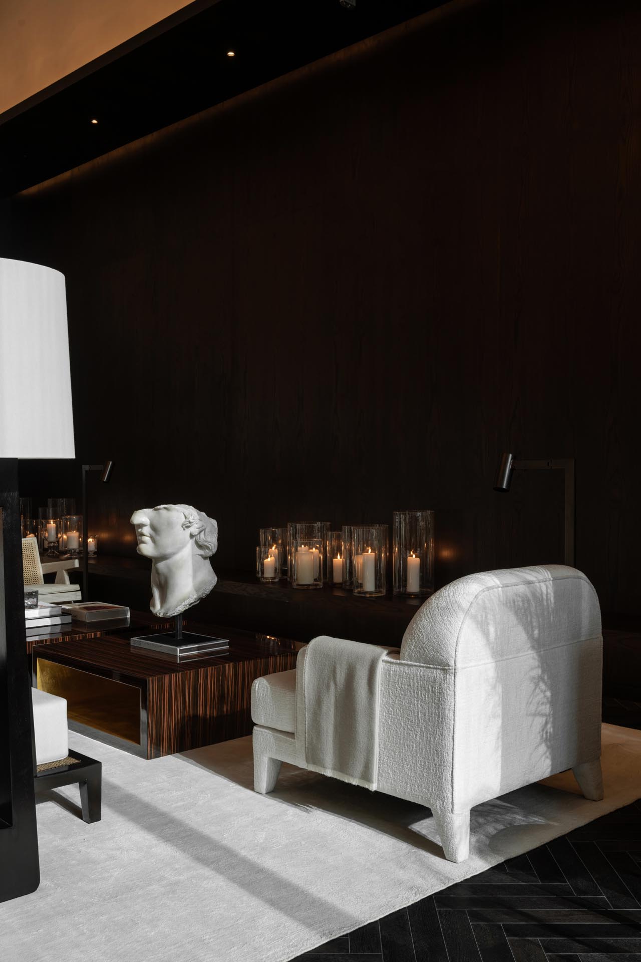
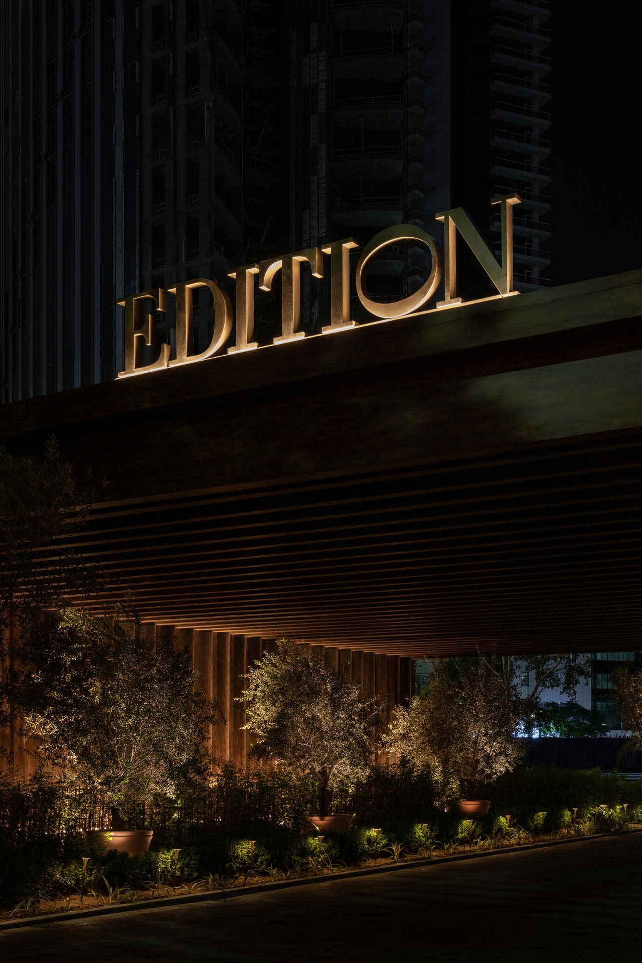
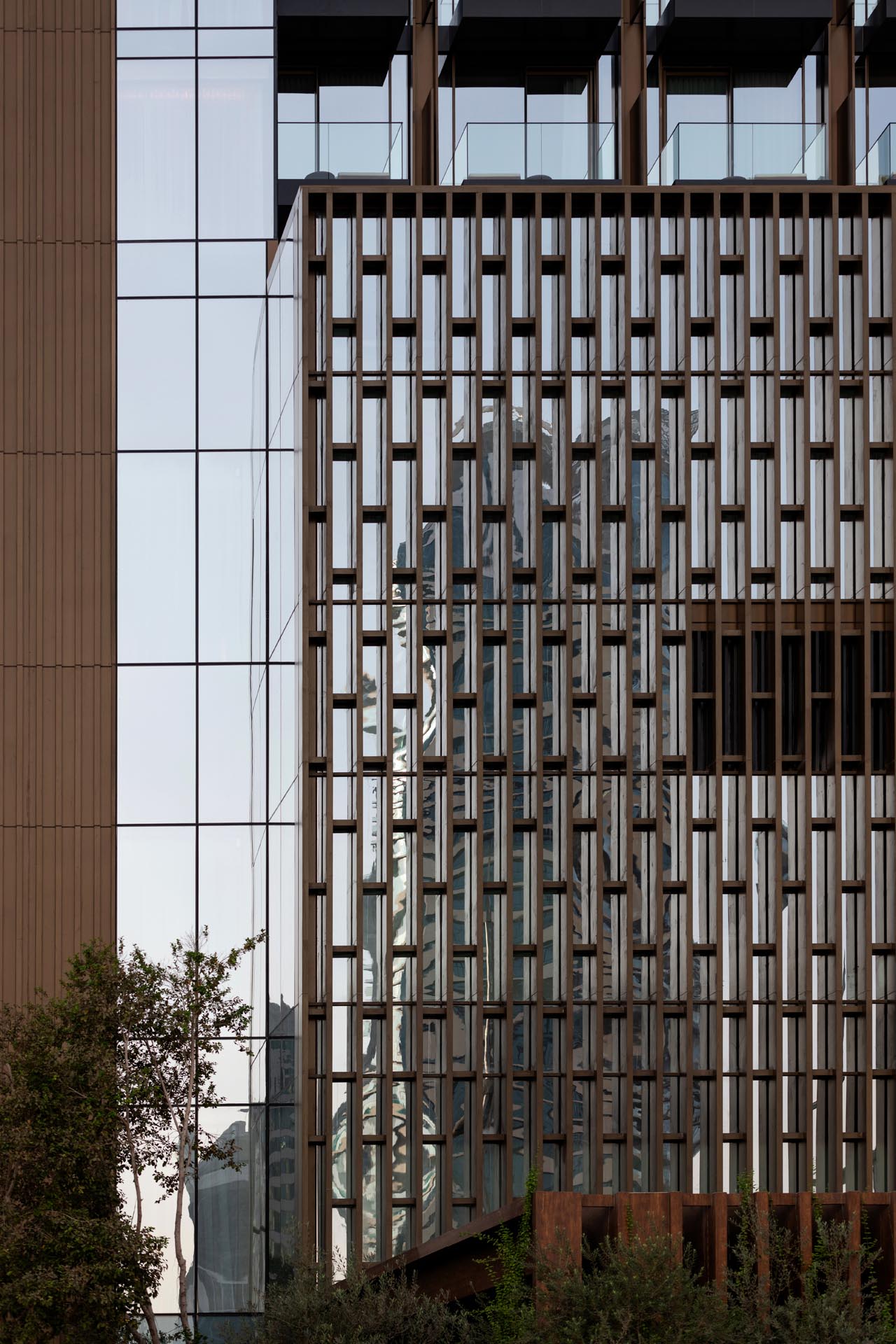
The 100-metre-high hotel tower sits atop a podium rotated 45 degrees off its axis in order to maximise views over the nearby Burj Khalifa. While the structure responds to the urban grain of the city, its warm materiality sets it apart from the surrounding landscape. The façade is crafted by blending bronze screens, subtly textured grey cladding and natural stone and timber. The natural colour palette further accentuates the glazed frontage. Every room at the hotel extends outside with a large, glazed balcony, adding a sense of rhythmic dynamism to the building. The floor-to-ceiling windows emphasise the sculptural internal double- and triple-height spaces, filling them with light. “The design is guided by simplicity and sophistication, free of ornament and yet luxurious in [international standing],” says Colin Doyle, partner and lead at LW Design Group.
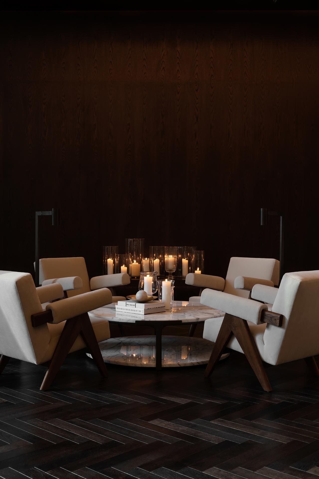
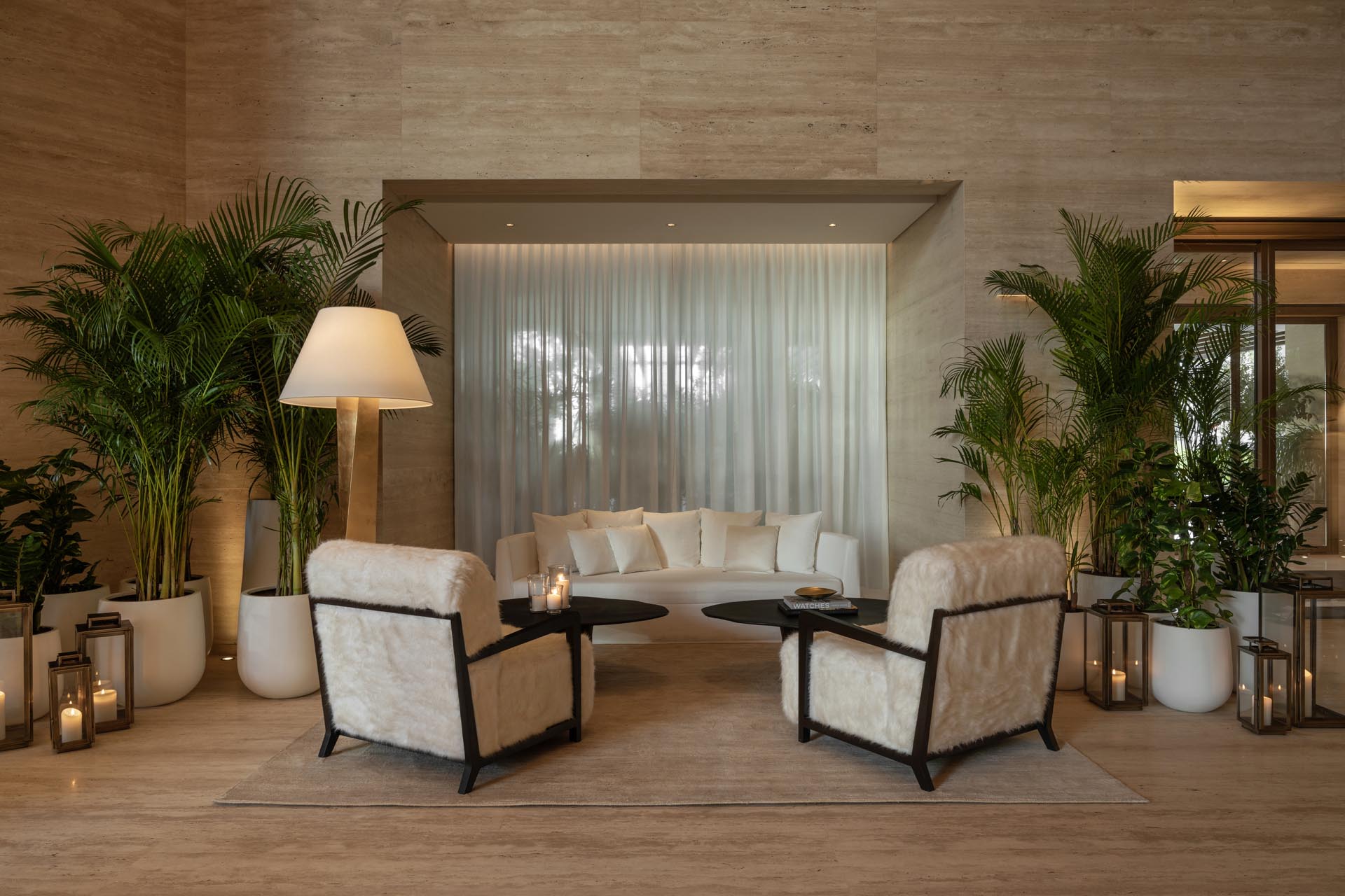
Inside, a journey through spatial volumes marks the space – including an arched ceiling featuring an impressive chandelier that grounds the triple-height volume. The layered lobby area is as unintimidating as it is dramatic, with carefully planned warm lighting designed in collaboration with London’s Isometrix studio creating an atmospheric interior throughout. At night, the lights are dimmed even further and enhanced with sensual candlelight. The lighting is focused on eye level to draw guests even deeper into a cosy cocoon. This approach is applied throughout, whether it is the comfortable pockets of seating in the lobby, the subdued lighting in the bedrooms or the atmospheric illumination in the bar and dining areas.
As with every Edition hotel, a central spiral staircase connects the lobby to the rest of the property. Revealing a triple-height cascade, the staircase is covered in Venetian plaster, and creates a statement within the overall space.
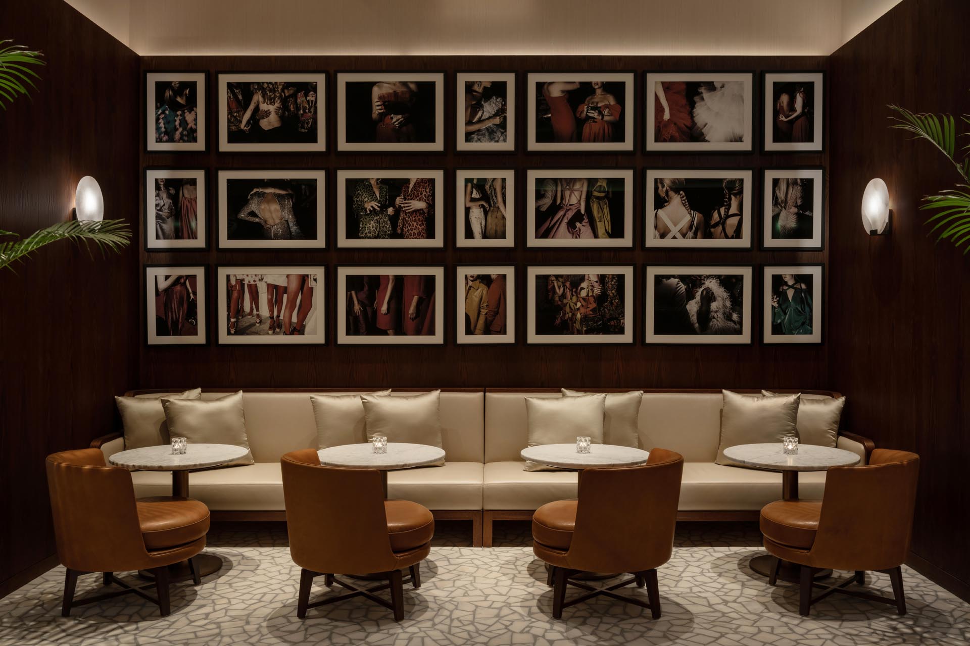
The effortless luxury of the lobby continues into the formal dining area, the Duomo Restaurant, now featuring pops of yellow to accentuate the spatial shift. The clever seating layout affords each diner uninhibited views of the arched ceiling, which features an immersive artwork designed by Onion Lab in Barcelona. High-quality projectors have been installed in the walls to map the digital art on the domed surface, the first of its kind for the Edition brand.
The hotel’s signature restaurant, Jolie, is filled with a showcase of natural and earthy colours and materials, from bronze finishes and tan hide chairs to the raised olive and gold chairs lining the U-shaped bar. Parlour palms and other tropical plants are scattered across the space, offering a sense of privacy, while the terrazzo flooring acts as the statement design element of the overall restaurant. The expansive semi-enclosed balcony-inspired terrace is covered, with artworks by Landon Nordeman adorning the walls.
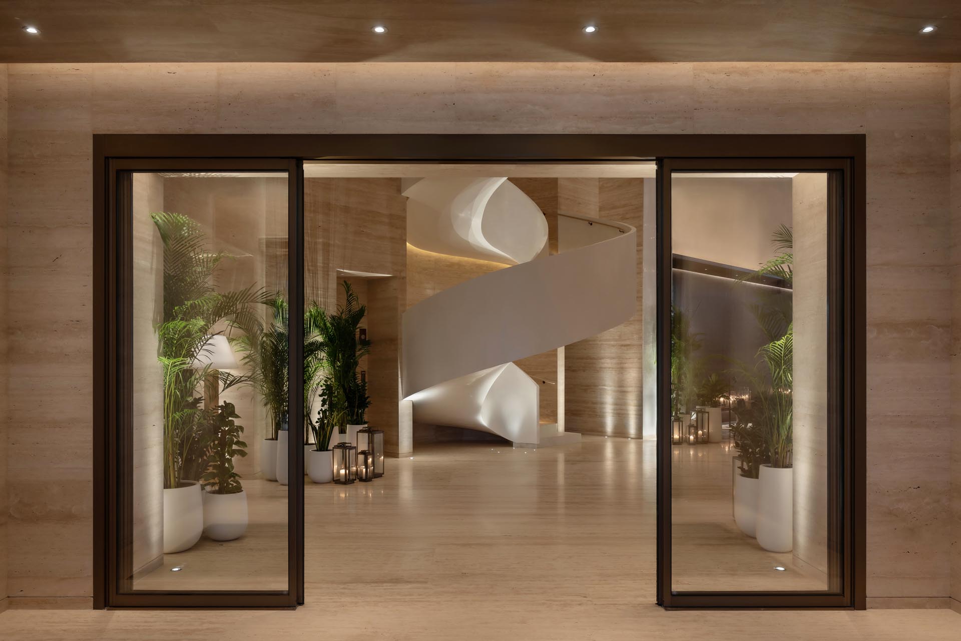
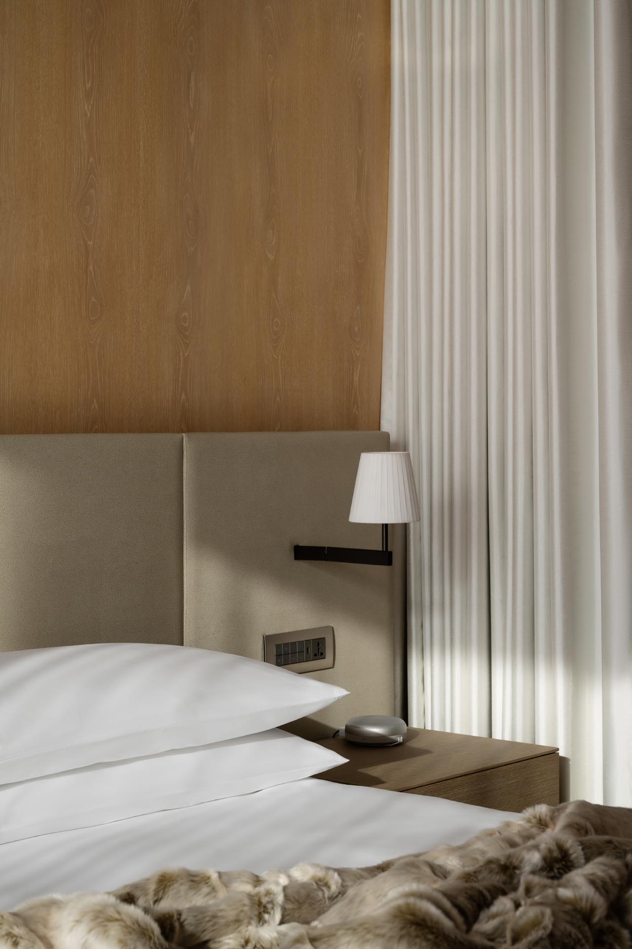
The Dubai Edition has 275 rooms and six different room categories, including a penthouse suite, which have all been completed using a unified design language featuring the same high-quality materials, used both in the bedrooms and bathrooms. The material palette is kept minimal, with a limited selection of finishes following the brand’s stipulations on simplicity and comfortable luxury, using light oak wood and stone accents that flow from one room to the other.
The simplicity of the design immediately brings attention to the minute details such as the matching veins in the natural stone and wood, which was a time-consuming and complex feat to achieve. Each piece was hand-placed and considered so as not to repeat the bands. Each bed features a soft leather headboard, while timber-lined walls offer an overall luxurious warmth to the space. Unconventionally, the rooms are free of artworks besides a piece by Carolle Bénitah, inspired by the Dubai Fountains, that depicts a young girl dancing in the water.
The hotel’s spa is very small, with only two treatment rooms, a sauna, a steam room and an outdoor swimming pool, completed using soft-coloured materials such as travertine and timber.
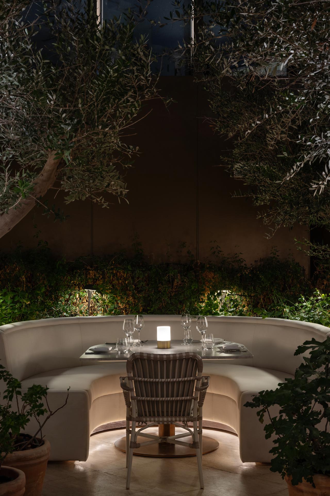
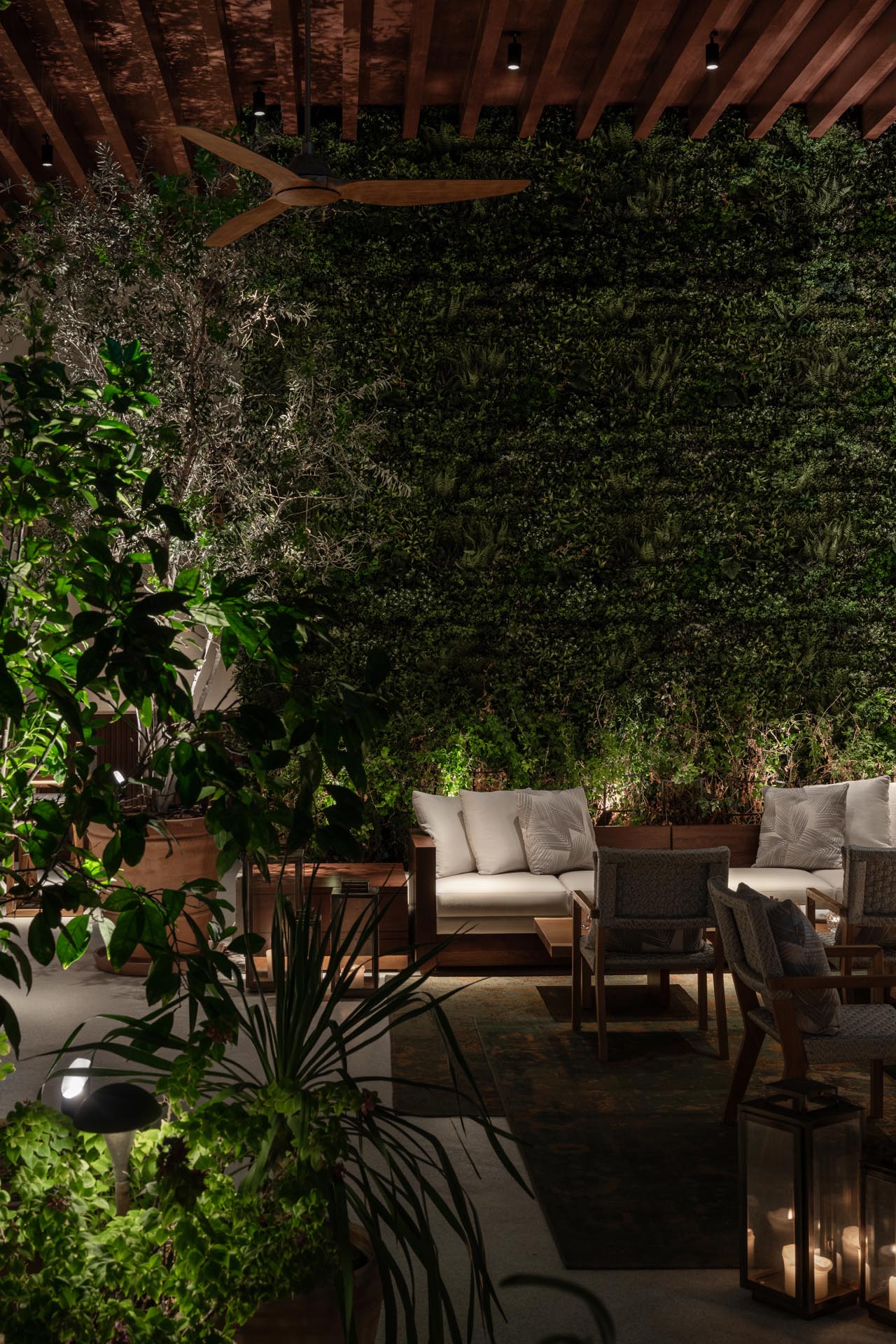
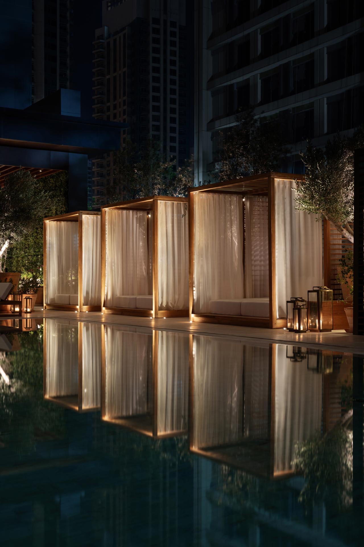
The landscaping of The Dubai Edition was designed by Madison Cox from the USA, who has crafted dreamy outdoor spaces, gardens and terraces. The densely populated plants create intimate spaces throughout the gardens, punctuated with bold terracotta pots and olive trees. When fully immersed in the distinct atmosphere of the hotel, it almost feels as if one has escaped Dubai’s urban sprawl – until looking up from infinity pool to the spectacular sunset that bathes the city in a golden light.
Photography by Natelee Cocks
The Latest
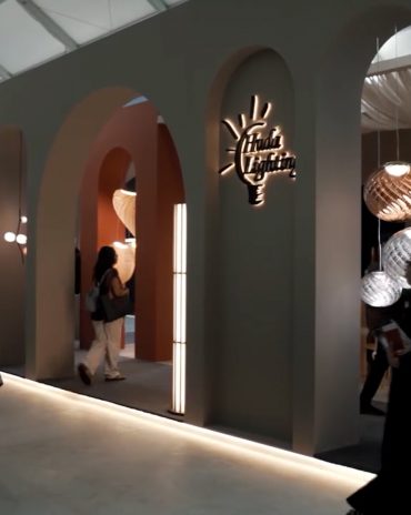
An interview with Huda Lighting at Downtown Design
During Downtown Design, we interviewed the team at Huda Lighting in addition to designers Tom Dixon and Lee Broom.
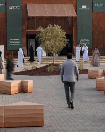
Downtown Design Returns to Riyadh in 2026
The fair will run its second edition at JAX District
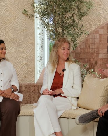
Design Dialogues with KOHLER
We discussed the concept of 'Sustainable Futures' with Inge Moore of Muza Lab and Rakan Jandali at KCA International.
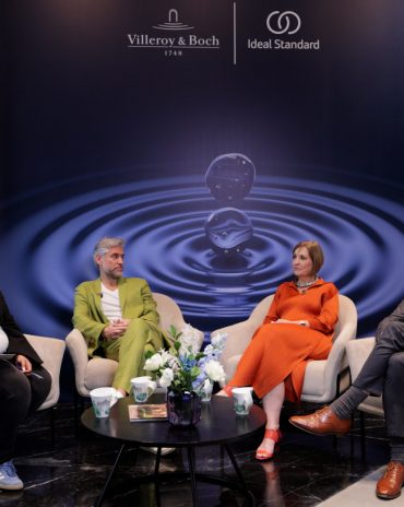
Design Dialogues with Ideal Standard x Villeroy & Boch
During Dubai Design Week 2025, identity held a panel at the Ideal Standard x Villeroy & Boch showroom in City Walk, on shaping experiences for hospitality.
A Touch of Luxury
Here’s how you can bring both sophistication and style to every room
Outdoor Living, Redefined
Messara Living and Vincent Sheppard Unveil “Outdoor at Its Best 2026”
NOMAD Opens Its Doors in Abu Dhabi’s Iconic Terminal 1
A modernist landmark is reimagined as a global stage for collectible design, contemporary art, and cultural dialogue.
In photos: Winners at the identity Design Awards 2025
Presenting the winners of 2025 identity Design Awards.
Identity Design Awards 2025 – Winner’s List
Here are the winners of the identity design awards 2025
Hogg’s Hollow
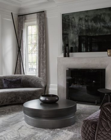
Set along the bend of a quiet river and sheltered within a mature, tree-lined enclave of Toronto, this riverside residence offers a dialogue between structure and softness, restraint and warmth
Salone del Mobile.Milano Paints Riyadh Red
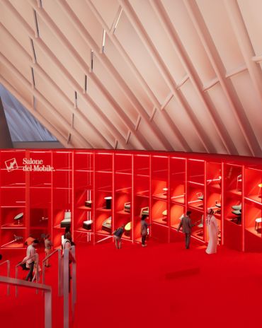
The “Red in Progress” installation marks a powerful first step toward the city’s full-scale 2026 edition
An interview with Fabio Masolo on the Giorgio Collection
A conversation on passion, timeless design, and bringing Italian craftsmanship to the world

