Copyright © 2025 Motivate Media Group. All rights reserved.
fortytwelve’s contemporary Ode Eatery in Kuwait blurs the boundaries between the kitchen and its diners
This minimal eatery in Kuwait plays with transparency and an eclectic furniture selection
One studio that has been consistently delivering a refined approach to hospitality and retail spaces is Kuwait-based fortytwelve. The studio is led by architect Khaled Alawadhi, who has in a short time developed a signature interior formula that is led by thought-provoking design solutions, sophisticated craftsmanship and exciting furnishing selections.
The Gulf city has recently become home to some of the most innovative and design-savvy food-and-beverage venues in the region, and fortytwelve’s expertise in the field has greatly contributed to this rise with projects such as Earth and The Bowl.
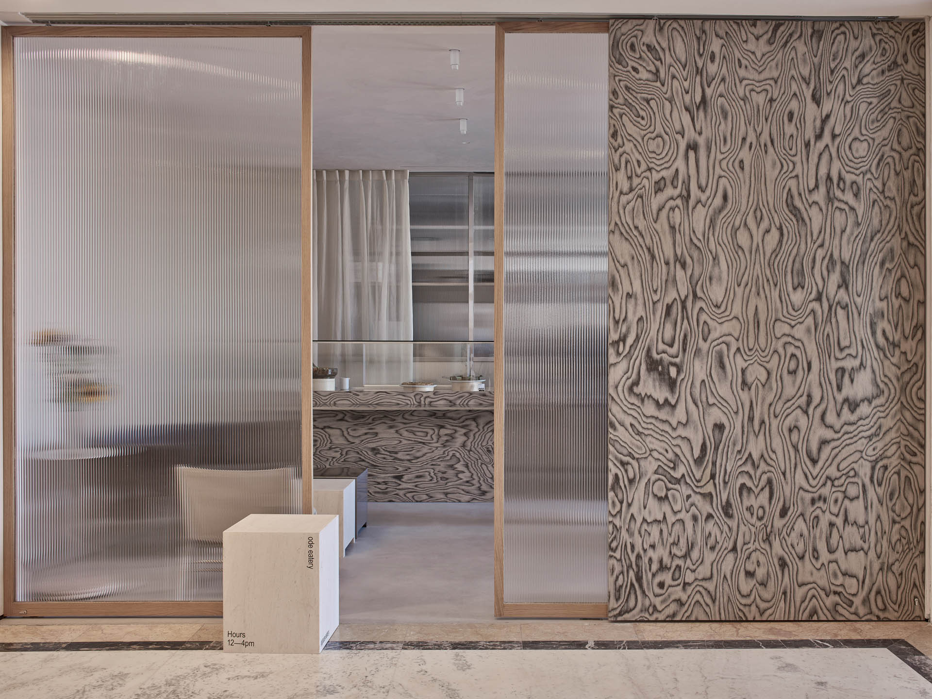
The boutique studio’s latest endeavour is the pared-back yet detail-rich Ode Eatery in Kuwait City, featuring an expressive use of materials and textures.
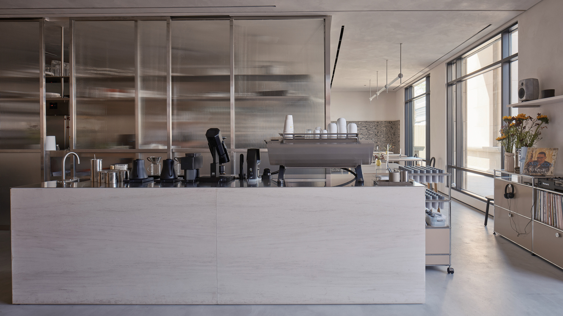
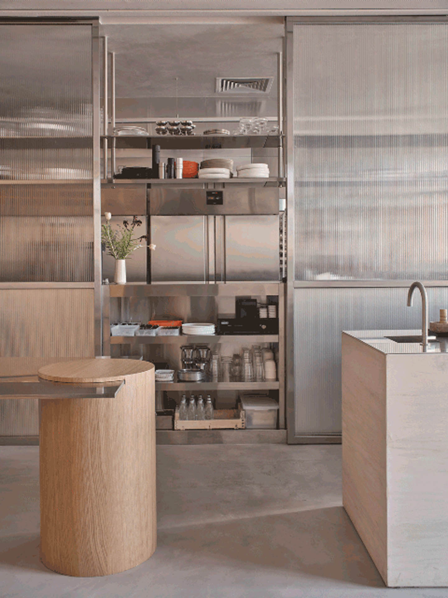
The studio worked closely with the client – who is also the chef running the kitchen – to create a highly functional space, focusing primarily on the kitchen itself and the display counter, which was achieved through a translucent fluted glass enclosure and a play on materials and volumes on the food display counter. Large windows allow ample light into the interior space, creating a playful interaction between the diners and the activity in the kitchen through movement and colour.
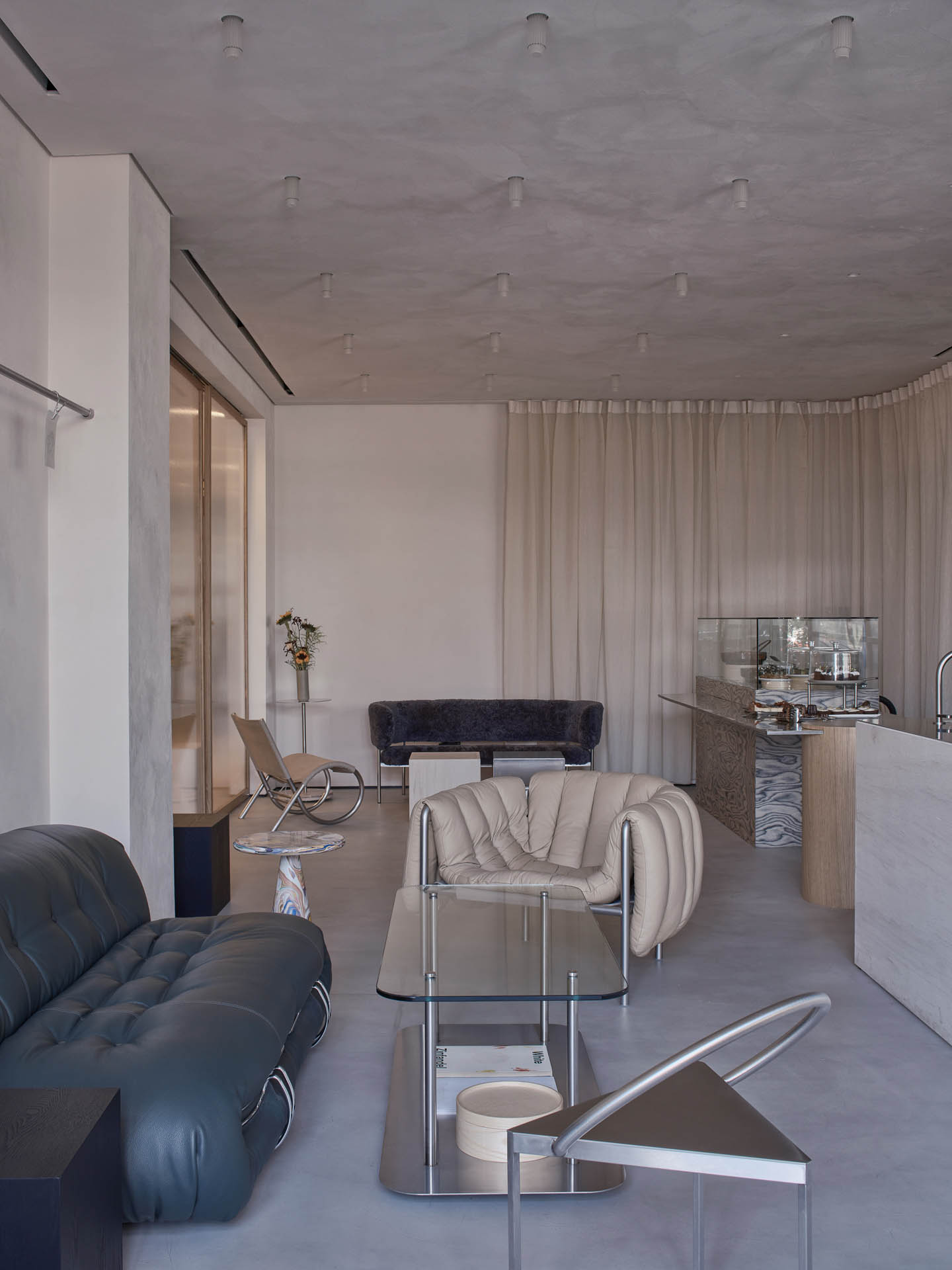
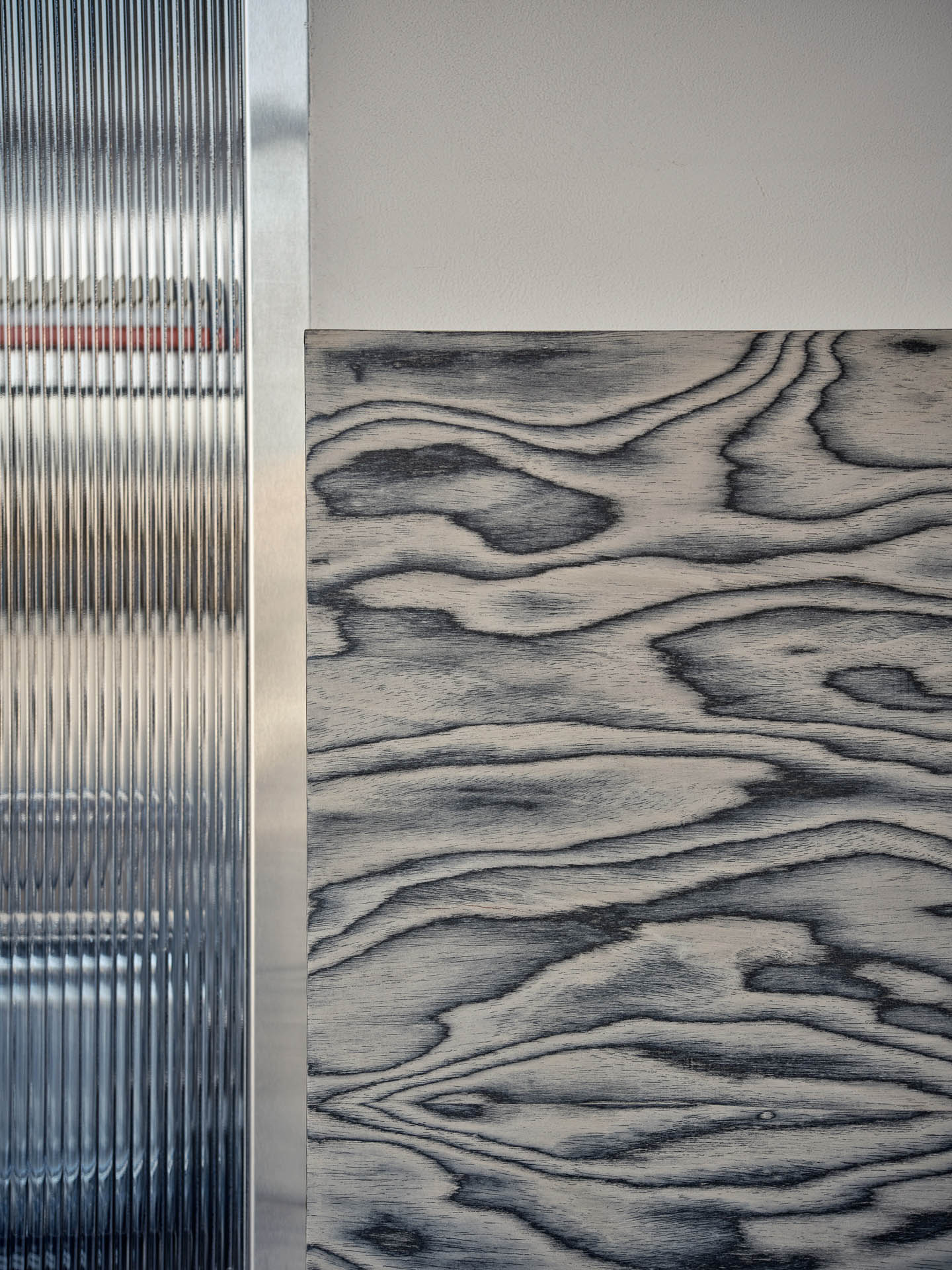
“We relied heavily on fluted glass, micro cement, a graphic wood veneer and beige stone to create all the main elements of the shop, while adding colour through the different furniture elements,” Alawadhi says.
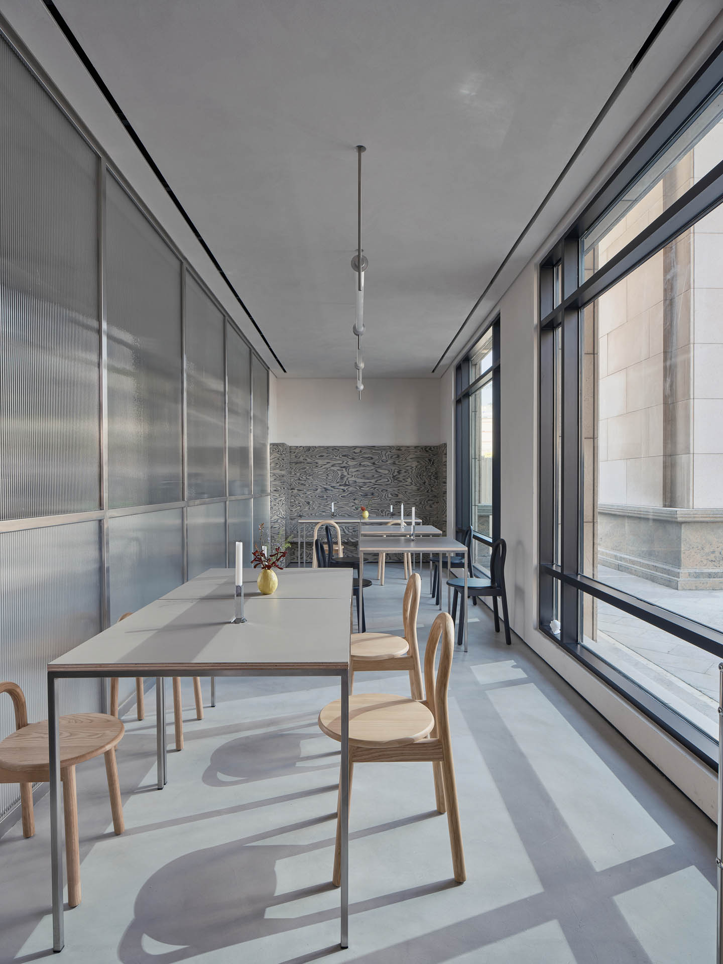
The carefully selected pieces of furniture are an eclectic mix of timeless pieces that enable a variety of seating arrangements, featuring the likes of Frama, Cassina, Dirk van der Kooij, Hem and DesignByThem.
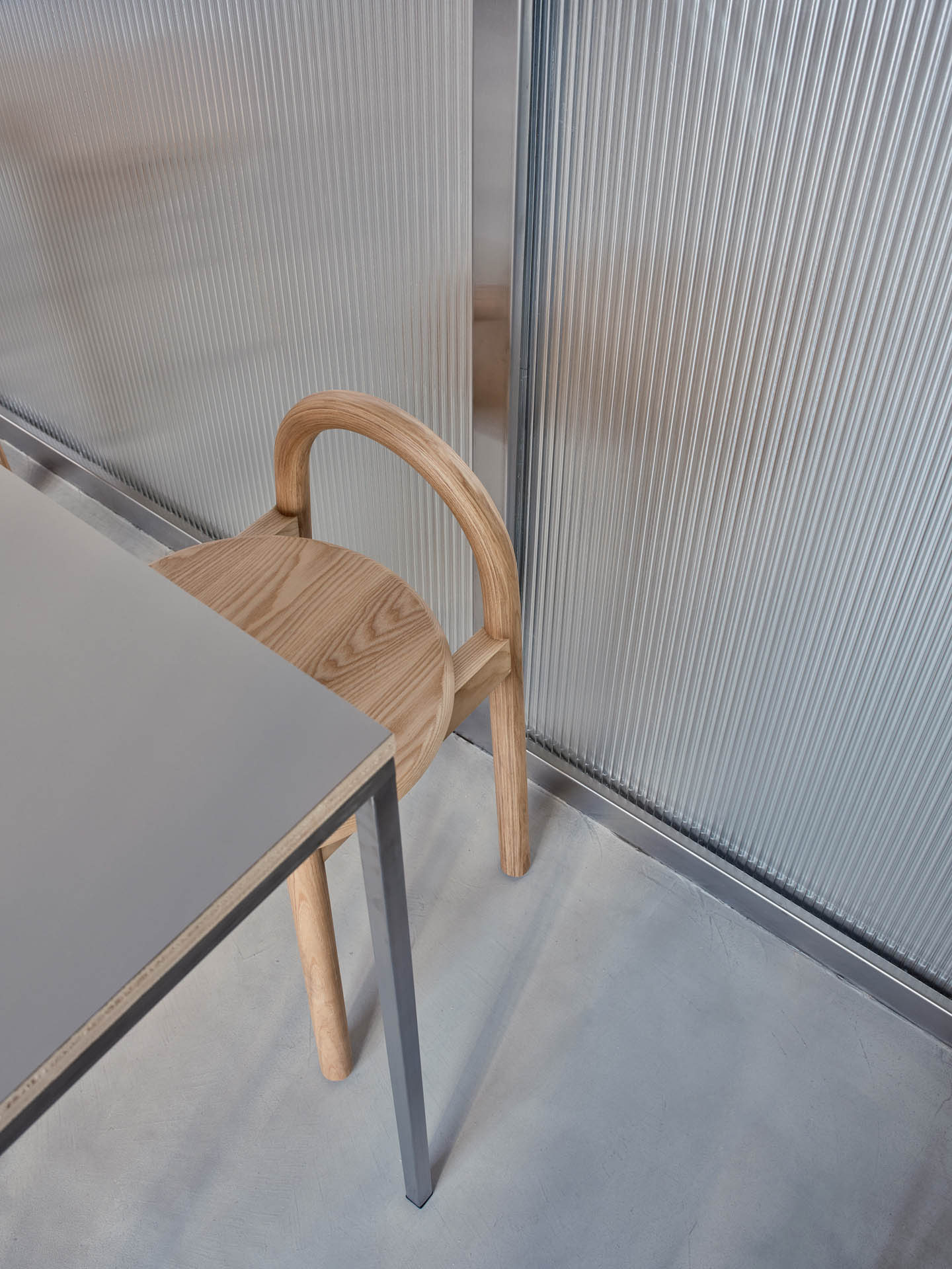
For the lighting, fortytwelve worked closely with Beirut-based Fabraca Studios to create custom light fixtures throughout the space, using the same fluted glass that was used in the kitchen enclosure.
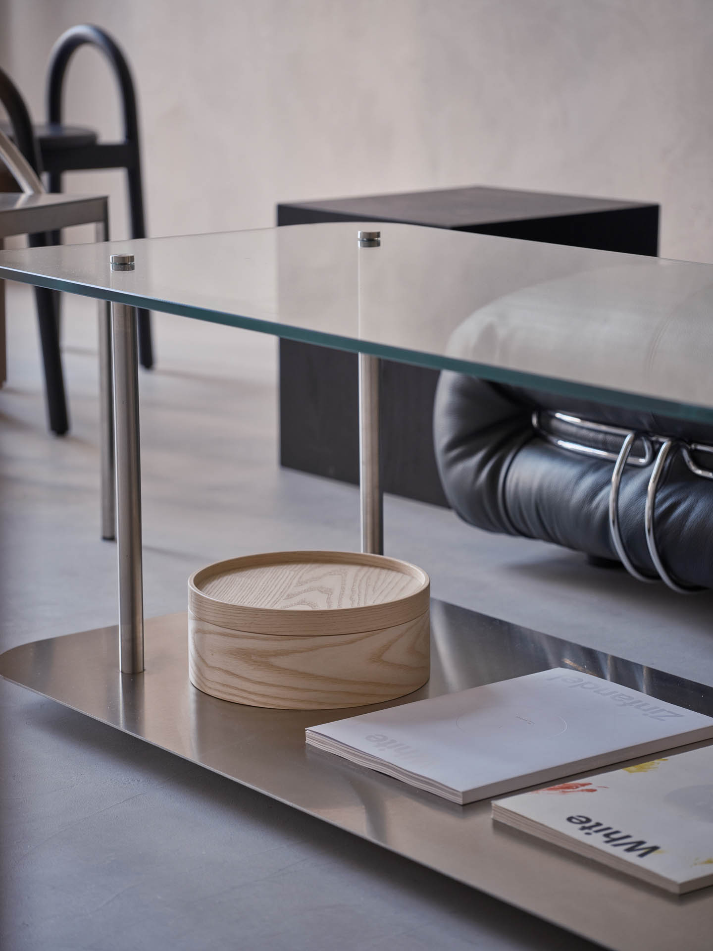
Artistic touches and graphic elements are peppered across the space, such as with the graphic wood veneer by Alpi that creates a sense of movement in the space. “At first, we considered marble but thought it would be too cold and rigid. Instead, the wood veneer provides the fluidity and movement found in marble while still being warm and comfortable, especially in seating,” Alawadhi explains.
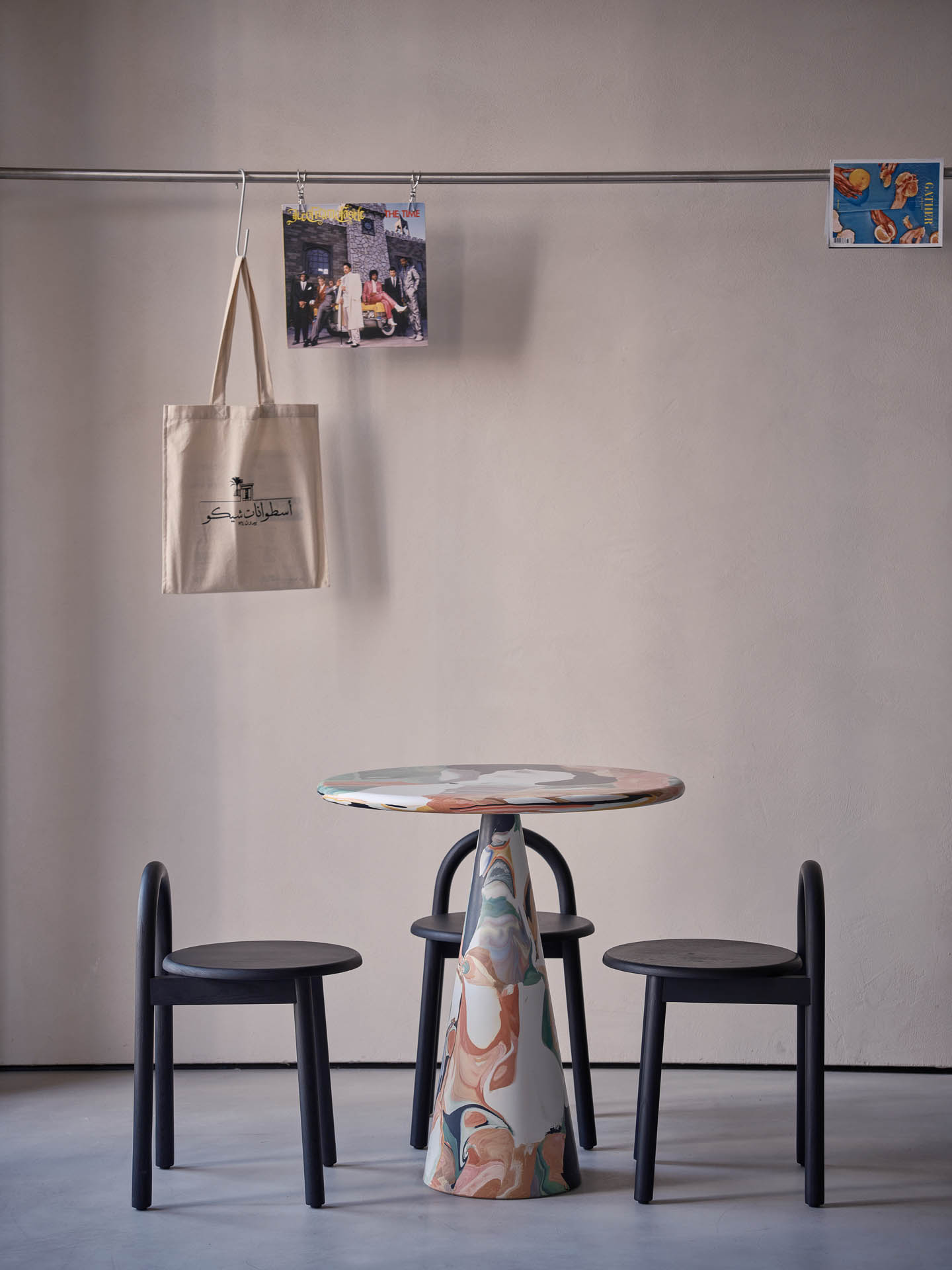
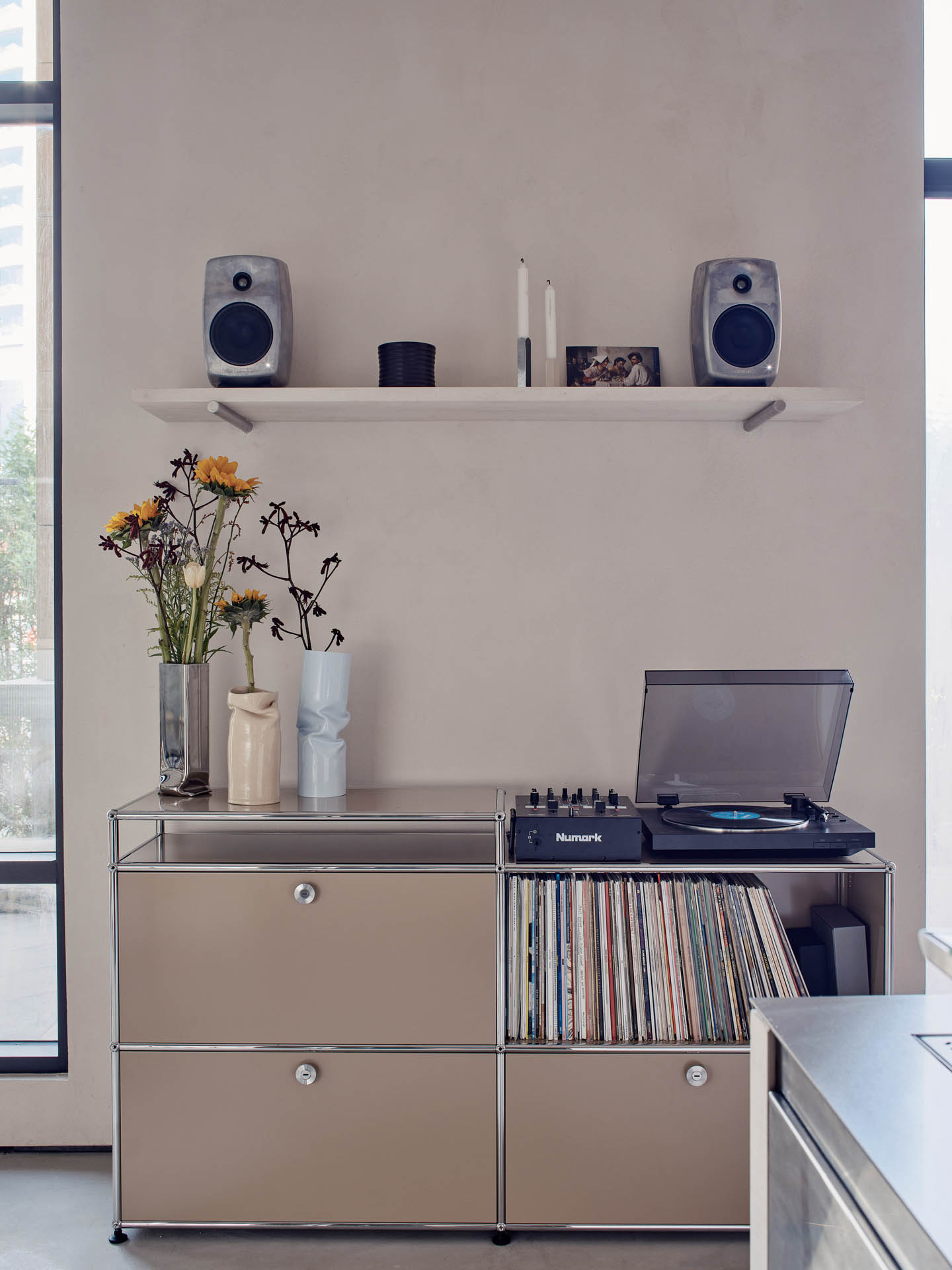
Other elements like grey cement floors, textured beige walls and stainless steel solidify the space.
Spreading across the space is a rail where various forms of artworks can be hung. “The rail was designed to create a dynamic feature in the constantly changing space. The rail showcases everything – from posters and postcards by artists the chef likes, to the daily menu and sometimes vinyl record covers,” Alawadhi says.
Photography by Mohammad Taqi Ashkanani
The Latest
How Eywa’s design execution is both challenging and exceptional
Mihir Sanganee, Chief Strategy Officer and Co-Founder at Designsmith shares the journey behind shaping the interior fitout of this regenerative design project
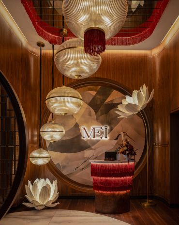
Design Take: MEI by 4SPACE
Where heritage meets modern design.
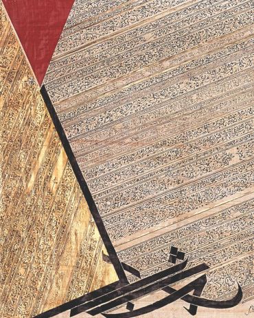
The Choreographer of Letters
Taking place at the Bassam Freiha Art Foundation until 25 January 2026, this landmark exhibition features Nja Mahdaoui, one of the most influential figures in Arab modern art
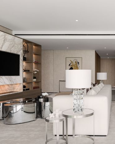
A Home Away from Home
This home, designed by Blush International at the Atlantis The Royal Residences, perfectly balances practicality and beauty
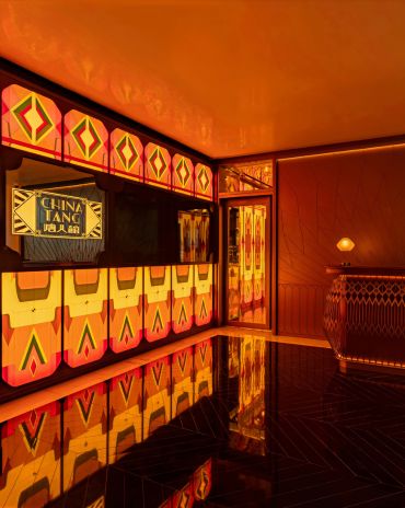
Design Take: China Tang Dubai
Heritage aesthetics redefined through scale, texture, and vision.
Dubai Design Week: A Retrospective
The identity team were actively involved in Dubai Design Week and Downtown Design, capturing collaborations and taking part in key dialogues with the industry. Here’s an overview.
Highlights of Cairo Design Week 2025
Art, architecture, and culture shaped up this year's Cairo Design Week.
A Modern Haven
Sophie Paterson Interiors brings a refined, contemporary sensibility to a family home in Oman, blending soft luxury with subtle nods to local heritage
Past Reveals Future
Maison&Objet Paris returns from 15 to 19 January 2026 under the banner of excellence and savoir-faire
Sensory Design
Designed by Wangan Studio, this avant-garde space, dedicated to care, feels like a contemporary art gallery
Winner’s Panel with IF Hub
identity gathered for a conversation on 'The Art of Design - Curation and Storytelling'.
Building Spaces That Endure
identity hosted a panel in collaboration with GROHE.

