Copyright © 2025 Motivate Media Group. All rights reserved.
Shakespeare Gordon Studio’s founders renovated their New York home with a playful design
From a conventional turn-of-the-century layout, the home was turned into playful design choices
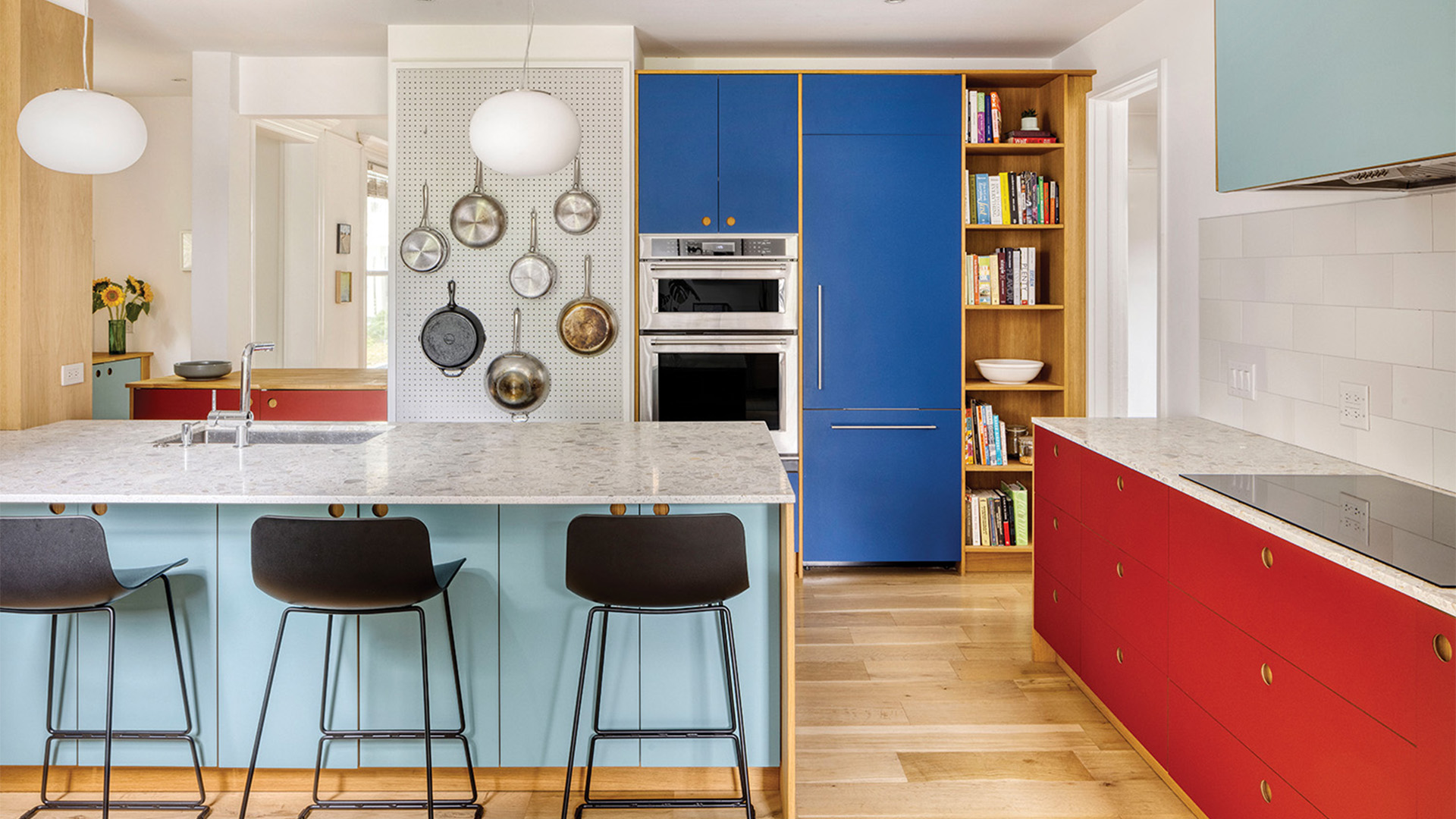
Shakespeare Gordon Studio renovated the interiors of their house in New York’s historic Ditmas Park neighborhood with a playful design aesthetics. When Amy Shakespeare and Mark Gordon, Principals at Shakespeare Gordon Studio, purchased the home in the historic neighborhood, they knew they were taking on a challenging project. The large, historic structure had been divided into many smaller rooms and dark, uncomfortable spaces over the course of its life. They decided to start their redesign in the attic, from the top down.
Attics are often underutilized spaces in traditional homes. Located up several sets of stairs, and with challenging spatial geometries, they frequently remain as leftover space that is mainly used for storage. Attics can be an afterthought when renovating a home, and the last places to receive makeovers.
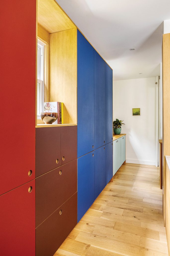
Four shades of brightly coloured linoleum
With Ditmas House, however, the designers realized that the attic might be the best place to begin. In transforming the dreary warren of small attic spaces into a light-filled primary suite for themselves, they established a new visual language for their later renovations of the home’s two main floors, a striking template for the process of reimagining their family’s home. The duo’s bold reorganization of space, which upended the conventional turn-of-the-century layout, informed playful design choices throughout Ditmas House.
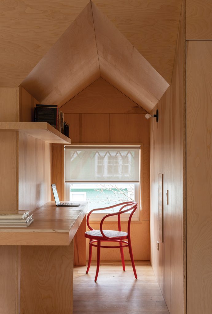
Built-in desk in primary bedroom
The primary bedroom suite in the attic serves as a case study of the choices that characterize the design logic of this project: a cohesive, flexible backdrop punctuated by bursts of color and definition that reinforce function. The main part of the attic, which spans the width of the house, is clad in a mix of white shiplap siding at the underside of the roof and ends of the gables. Solar-controlled operable skylights introduce natural light and air into spaces that had previously been very dark. Exposed natural plywood panels blanket the balance of the walls and dormers, and are also used to create custom storage closets, a dresser, bookshelves, and a desk for Gordon’s home office. These interventions create a light, airy space that is elegantly malleable, with a range of subtle, cohesive built-ins to support that flexibility.
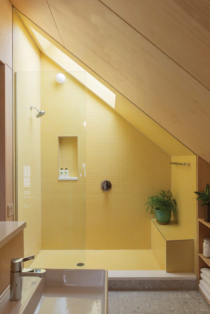
Primary bathroom
Meanwhile, two large sliding panels in different shades of red provide definition to the room, with one marking its entrance and the other serving as the door to its ensuite bathroom. The primary bathroom embodies the flip side of Shakespeare and Gordon’s design philosophy for the house; eye-catching colors and materials draw attention to specific elements, highlighting the specific functionality of this different kind of room. This concept is epitomized by the walk-in shower, a triangular prism tucked under the roofline and defined by bright yellow tiles that are activated by sunlight from above.
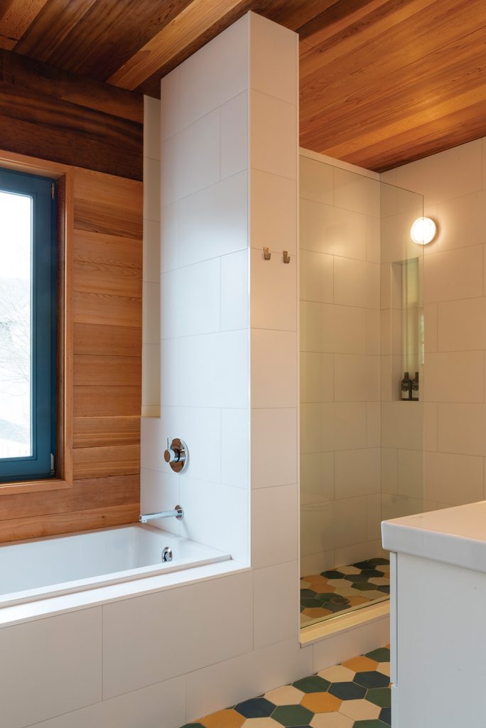
Secondary floor bathroom
Elsewhere in the home, the high-contrast color palette continues to differentiate element and function, while materials such as wood once again blend flexible built-ins into the house’s existing structure. Solid character-grade oak runs through many of the renovated areas of the house, and oak panels climb up the sides of the terrazzo kitchen countertops and encase a built-in bookshelf and a structural column. These elements reappear in the second-floor bathroom, where cedar lines the walls and ceilings and multi-colored hexagonal tiles can be found underfoot.
From the sunlit suite at the top of the home, to the easygoing elegance of the first floor, Ditmas House’s synergistic blend of natural light, bold colors, and expressive materials reanimate this historic home.
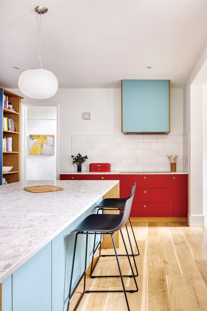
BROOKLYN, NY – July 10, 2023: Kitchen of 472 E 16th St. Photogrpahed for Shakespeare Gordon Vlado Architects. CREDIT: Katherine Marks
Technical sheet
Official Project Name: Ditmas House
Location: Brooklyn, NY
Architects/designers: Shakespeare Gordon Studio
Design team: Amy Shakespeare, Mark Gordon
Photography by David Gilbert and Katherine Marks
The Latest
Marvel T – The latest launch by Atlas Concorde
Atlas Concorde launches Marvel T, a new interpretation of travertine in collaboration with HBA.
Read ‘Regional Excellence’ – Note from the editor
Read the magazine on issuu or grab it off newsstands now.
Chatai: Where Tradition Meets Contemporary Calm
Inspired by Japanese tea rooms and street stalls, the space invites pause, dialogue, and cultural reflection in the heart of Dubai Design District
A Floating Vision: Dubai Museum of Art Rises from the Creek
Inspired by the sea and pearls, the Dubai Museum of Art becomes a floating ode to the city’s heritage and its boundless artistic ambition.
Heritage Reimagined
Designlab Experience turns iconic spaces into living narratives of Emirati culture, luxury, and craftsmanship.
Nakhla by Nada Debs
Nakhla symbolises resilience, prosperity and a deep connection to the land
Wave: The New Mediterranean Haven in Dubai
IDST’s design invites exploration with a thoughtful blend of artisanal craftsmanship and contemporary style.
The Chedi Wadi Safar
Bjarke Ingels Group (BIG) and KCA International are collaborating to launch this new hotel
A New Era of Early Learning
Roar crafts the PIF Daycare Centre in Riyadh with a calming, sensory-rich environment where design, nature and childhood development come together.
When Art Meets Light
Brush and Switch by Sans Souci bend light in unexpected ways
The Importance of Community-Driven Design
We speak to Joanna Varettas, Senior Associate Designer at TGP International on the story of Seed & Bloom – a café designed to nurture connection and community engagement
Finasi x ROAR presents – Made in UAE
For this year's Downtown Design, Finasi and Pallavi Dean will unveil a bold new installation that speaks the language of material honesty, exceptional craftsmanship, visionary design, and local identity.

